The Re-emergence of Flat Design
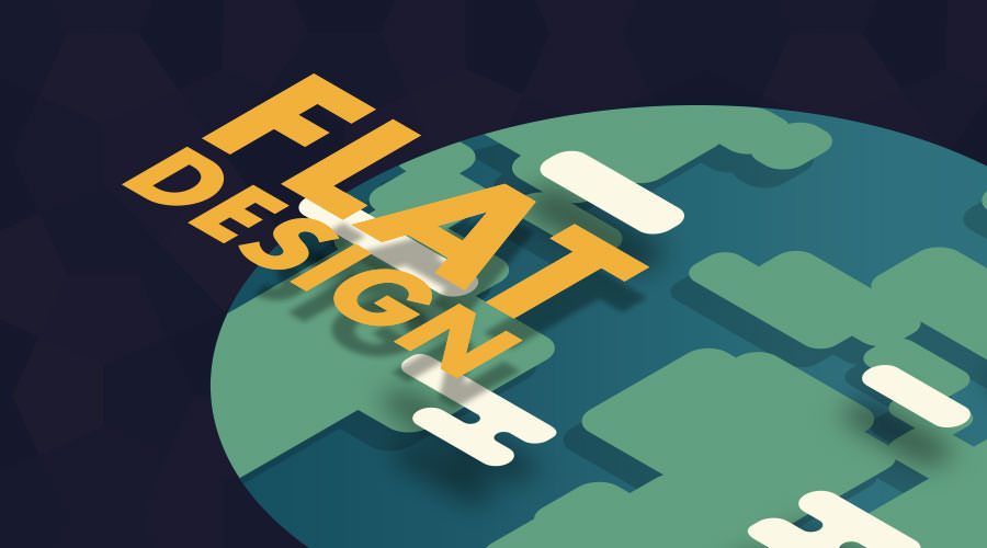
Flat design is a style of interface design emphasizing minimum use of stylistic elements that give the illusion of three dimensions (such as the use of drop shadows, gradients or textures) and is focused on a minimalist use of simple elements, typography, and flat colors.
Flat design makes it easy to quickly convey information and works great in responsive website design. Minimal design elements allow websites to load faster, resize easily, and still look sharp on high-definition screens.
For these reasons and more, flat design has become synonymous with the major interfaces we use every day.
Looking Back
It started in the 1950’s and 60’s (with influences from International Typographic Style, Modernism design, and Bauhaus architecture) but didn’t take the spotlight until the mid 2000’s. And now, we’re seeing a strong flat design re-emergence today!
Two major product releases are responsible for the mass appearance and transformation of flat design among smart devices, computers, applications, and web pages.
Metro
Metro was the first official design language for Microsoft products and applications. Big implementations of Metro were the release of the Windows Media Center in 2002 and the redesign of the Zune MP3 player in 2006. The company’s product releases since — from their phone to operating system to Xbox 360 to the Office suite — have had flat design front and center, until Windows 10. Metro has now been replaced with the Fluent Design System that features large “live tiles” and simplistic typography.
iOS 7
The official release of iOS 7 in 2013 moved Apple products away from Skeuomorphic design and put them in the center of minimalism. (Skeumorphic design, btw, is when an object’s shape suggests its use. For example – an online calendar app that’s designed to appear to have the binding of a paper desk calendar.) is The next year, Apple also updated their operating system with a flat design that was similar to their iOS counterpart on OS X Yosemite.
Today
More than likely, most of your devices use flat design or some variation of the style. This everyday familiarity is allowing designers to become more confident with the use of its elements.
Which leads me to the prediction that 2018 is going to be a big year for flat design. We’ll also see more of Flat 2.0, which uses subtle gradients and shadows to present interactions (something designers were finding challenging with flat design).
With that new-found confidence in play, we’re about to see a change in the way we view flat design. Instead of minimal designs that focus on usability, we’ll see brighter, more explosive designs that use the same simplistic interaction elements that make applications easy to use.
Let me share some examples to show you how the style is evolving this year.
Boite a Oeufs (Egg Box)
Egg Box is a French-based digital studio that focuses on developing brands. Their website is a prime example of flat design being infused with animation, illustration, and color fields to lead users through their site. The monochrome yellow theme creates eye-catching sections, and the animations make you feel like you’re part of the brand.

EG Wine Co.
EG is redefining the wine industry by targeting a young audience that is constantly on the go. Their brand is full of bold colors and large, all-cap typography. Their messaging has a straightforward voice that feels down to earth. There’s no sommelier running this site. Instead, the brand invites the average person to take part by encouraging pairings with street food, music, and moods.
The site focuses heavily on typography supported by visuals of smiling faces and videos of people on the move. Some flat illustration and pattern work is also tossed in to break up visual rest. A heavy grid organizes the site while flat buttons call out action items.

Weslaco, Texas
Okay, this is probably the best government site I’ve ever seen (not fanboy-ing or anything). A clean look with nice messaging, supported by historical photos of a relaxed environment, creates a feeling of voyaging to an undiscovered destination. But, don’t get confused about the point of the site, you can still pay your water bill or file a 311 request.
The colors and negative space makes it feel airy and relaxed. Weslaco contrasts most government sites that create stressful interactions. Even the navigation of the site brings an ease to the interaction with a black background that limits distractions. In fact, the only places the color black is used are UI elements as actionable sections. The color strategy lets users understand what they can do on the site without putting forth effort.

On the Horizon
Flat design with the addition of bold color and advanced user interface (UI) research is the next big trend. We’re already starting to see a shift in the way designers are pushing towards a stylistic change that involves these types of techniques.
I think UI elements will be more supported by negative space, grids, and bright colors. Airing things out will make sites feel more relax.
As far as conversions are concerned, this could help users stay on sites for a longer period of time, which may make them more inclined to buy a product or service. Sounds like a win-win to me!