Type Foundry of the Month: Arabic Typography
Arabic type is a hot design topic this year.
History, integration of cultures, and contemporary issues have brought type in different languages to light. This gives us an opportunity to learn and absorb other cultures and techniques for good.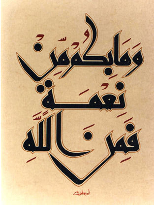
Integration like this is growing, so for this edition of Type Foundry of the Month, let’s run through a short history of Arabic scripts/type and the challenges they are facing.
Kufic
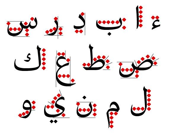
Kufic is the most bare-bones style of Islamic typography. It’s angular in nature and originally had filled counter elements. This complemented the curved letterforms, which are more sparse than other versions of Arabic calligraphy. When Kufic was made, around the 7th century, Arabic only had 17 letters. Today’s version has around 29, with numerous glyphs and didactic marks that help with pronunciation.
 Naskh
Naskh
This began as a cursive script used for informal purposes, because it had to keep up with conversation in note taking. It was the definitive cursive script of the Arabic nation around the 10th century. Since then, this style has been standardized in modern Arabic print.
Other Styles
Since the expansion of Islam throughout history, the style of writing has changed from region to region and across many languages. Persians, Ottoman Turks, and the Chinese are just some other cultures that have augmented Arabic type to integrate the writing as well as the religion into their cultures.
Eye on Design
Arabic type not only comes from a historical point in design, but recent contemporary issues have forced designers to pay attention to the integration that is happening amongst cultures.
This is not a bad thing. Those issues are bringing up interesting conflicts and problems in type and print. In WIRED, Peter Bil’ak of Typotheque, explains western-nomativity problems in type design and print.
” …if you look at Fonts.com, you’ll find more than 20,000 Latin font families,” Bil’ak said. “By comparison, there are just 108 Arabic font families.”
He also goes on to explain that the Middle East is slower to adopt digital devices, so designers are slower to practice modern type techniques in their languages.
“The digital age is changing the way we use and understand typography in other languages. We’re taking the same concepts we use in Latin type and applying them in new ways.”
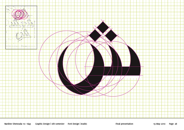
We can even see hints of Western grid systems being integrated during the process of creating Arabic typefaces.
TPTQ Arabic
Peter Bil’ak and Kristyan Sarkis, both of Typotheque, created the foundry TPTQ Arabic. Their main focus is solving the contemporary type issue amongst Arabic scripts and create an educational medium for type designers and enthusiasts. Give their site a look.
And if you want some Arabic type inspiration, here’s a Pinterest board of some logotypes. Scroll away!