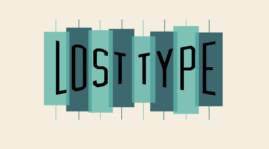
Type Foundry of the Month: Lost Type Co-op
I’m excited to introduce a foundry that’s a little different from the others this month.
Lost Type Co-op is a pay-what-you-want type foundry dedicated to the idea that quality fonts should be be made available to anyone who wants to design something full of character.
It was created in 2011 by current manager Riley Cran and his co-founder Tyler Galpin. Since then, more than 50 typefaces have been created by designers from all over the world, and 100% of the funds go directly to the respective designer. Browse the library of fonts for some inspiration!
Recently, Lost Type has been featured in projects for Nike, Starbucks, Disney, and the President of the United States. Among these different typefaces are a couple fonts that I personally really like the look of. Here they are:
Calafia

Calafia was inspired by left-handed brush lettering and created by designer Neil Secretario. With the way it includes a different collection of settings for capital letters and supports over 100 languages, it truly reflects the beliefs of the cop-op — High quality fonts should be available to all.
Mort Modern

Mort Modern was designed by co-founder and current manager himself, Riley Cran. There are actually 24 standard Mort Modern fonts in the family. They are inspired by the mid-century advertising lettering of Mortimer Leach.
The Owner: Riley Cran
Cran is a type foundry in and of himself. Along with showcasing other designer’s work on Lost Type, his own work has also been recognized by Communication Arts, HOW Magazine, American Institute of Graphic Arts, and more.
“Design strikes me as a trade where learning from history is a necessity,” Cran said in an interview with LogoLounge. “As a trade, we’re constantly trying to put a fresh spin on what we do, but it has to be iterative and influenced by the past in some degree.”
You can really see this thought process put to work in his design. For example, look at this:
Escafina

“Escafina” was created by Cran in 2014. He started the design process by compiling samples of upright script lettering, and doing a lot of research about the aesthetics of vintage signage and mid-century advertising. While he was gathering lettering samples from old mid-century ads, he recognized a problem with them.
Fonts used in mid-century advertising typically did not have much work or thought put into how the letters would connect and work together on a piece. So, the further Cran got into his design of Escafina using these mid-century fonts as inspiration, the more emphasis he put on making the letters work together in unpredictable orders.
Final Thoughts
I think it’s safe to say that Riley Cran has a brilliant knack for font design. His founding of Lost Type Co-op is an extremely innovative idea that has brought more creative minds into the mix and increased the availability of beautiful fonts for all.
How awesome is that?!
About the Author: Gussie Gaston is a senior at Chattanooga School for the Arts and Sciences. She’s interning at Papercut to learn about graphic design as part of her senior project on the psychology behind fonts and colors and how designers use them to their advantage.