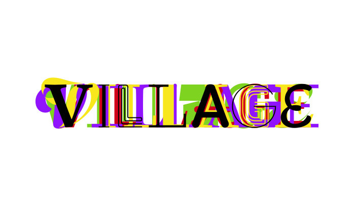
Type Foundry of the Month: Village
Hey type readers!
I always look forward to chatting about typography with you each month. This time, I’m going to showcase Village foundry. Village is a design co-op featuring foundries and designers from around the world. Its partners are separated by countries and even continents, but their main office is located in the DUMBO neighborhood of Brooklyn, New York. Its 11 foundries make decisions about their typeface releases online and alongside their fellow partners. It’s a pretty interesting way to make work and collaborate on a worldwide scale!
My Type of Learning
What makes Village so unique is its continued emphasis on growth and learning. It is a community that helps encourage the careers of future typographers. The Village Incubator allows young designers to submit their work and receive feedback from Village designers. Some of the Incubator’s submissions have even gone on to be used in published and distributed works!
If you really want to learn about type, the Village website is the place to visit. Here you’ll find intricate explanations of their type families’ designs from minor details about ink traps and x-height, to the roundness of characters.
My Picks
Most of Village’s typefaces are recognizable by their small quirks and large x-height. The letter spacing in each collection is carefully planned, and exaggerated line strokes (known as swashes) add a personalized touch. Here’s a look at a few of my Village favorites.
Odesta
(Thanks to urtd.net for this image)
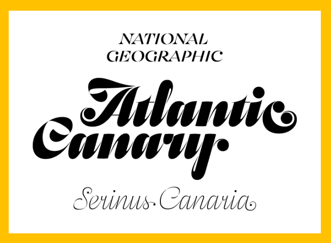
I usually stray away from putting script faces on the blog, but I couldn’t help myself after seeing Odesta. This ornamental font was inspired by a wedding invitation and is calligraphic in form. I was immediately intrigued by its dislocated swashes and polarized line weight. When you alternate line thickness to that degree, the impact is often dramatic. In this type family, spacing between line strokes is sometimes so small you have to take a second look to see the disconnection. But that’s okay, because every time you look you discover a new form.
Merlo
(Special thanks to vllg.com for this image.)
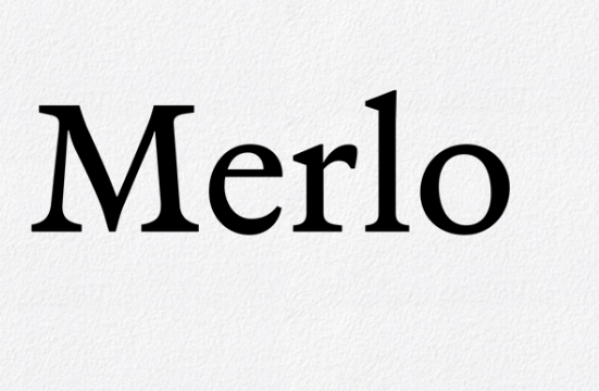
The font Merlo is a rebirth of Ismael Merlo’s types shown in his specimen book, Muestras de los punzones y matrices de letra que se funde en el obrador de la Imprenta Real, Madrid. Portuguese designer, Mårio Feliciano holds true to the type’s heritage by mimicking its original Spanish letterpress design. Just as the fonts that came before it, Merlo’s clean simplicity continues to line the pages of print and can be seen in many Portuguese and international publications today.
(Thanks to vllg.com for this image)
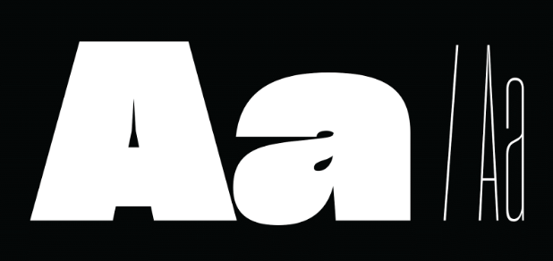
Sharp Grotesk Black No.25 / Sharp Grotesk Thin No.05
There are several versions of Sharp, but I’m choosing Grotesk specifically because I’ve seen some interesting things done with this type. Conceptually, it’s a 20th-century American take on Swiss styling. The thin weights show the font’s individuality, while some of the thicker families are crass and imperfect. The varying weights bring an expressiveness to each design, and there’s a beautiful blend of moods created through its letter spacing.
A Welcoming Village
Some would say that good design takes a village. Village type foundry, to me, is a network that encourages constant learning in our art. I’d like to think of the type foundries blog series in a similar fashion – a place for us to chat and be inspired by interesting design. So feel free to leave a comment. I’d love to continue the conversation.