Are Website Popups Good or Bad?
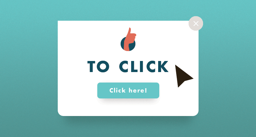
To Click Or to Close, That Is the Question
When asked this question, it’s hard to not let personal biases get in the way.
“BEGONE with the popup!!!” is my first instinct. But, after thinking more, I recall pleasant experiences that seemed more like waving bye to a friend versus slamming my mouse on a close button 5 times.
It can’t be denied that popups are more often than not fairly effective. In a study by social media guru Dan Zarella, the addition of popups to his personal site nearly doubled his email subscriptions, while his bounce back rate remained about the same.
The trick is balancing between visibility and obstruction. The best-case scenario is intriguing your user enough to follow the call to action. The worst-case scenario is your user becoming so frustrated that they leave your site.
So what dictates a good popup from a bad popup?
Branding/Storytelling
In this day and age, branding is key. It’s what makes your business original. So, why not have some fun with your calls to action?
Keeping the messaging authentic and using this opportunity to tell a story of how your brand can better someone’s experience builds trust, creates a comfortable environment, and makes them that more likely to give you contact information.
Design
Probably one of the more important things to keep in mind in terms of design is ease of getting out of the popup. Have a clear close button/exit strategy!
For mobile, it is best to put the touch targets where users can easily access them. Utilize “touch zones.” This is where the thumb can easily reach (usually on the bottom right of the screen).
Using no imagery or very simplified visuals is generally a good route. Balancing an interesting design with simplicity will make the most successful popup.
Messaging
Keeping the language short and simple is key. In the end we all want to get to the point as quick as possible.
It is also important to keep the wording genuine. Some of the older popups we’ve seen have what seem to be disingenuous wording. Users can choose between “Yes, get our awesome newsletter” or else “No, I want to be bored and sad.” This causes mistrust and frustration, and lessens the credibility and professionalism of the business.
On the other end, using simple, friendly language that seems more like day-to-day conversation can really help build trust. A great example of humanistic dialogue is TurboTax. (I could go on and on about this, but that is another blog post.)
Placement
First question: is there a location on the user’s natural path where this message would work even better than a popup?
Think about the workflow of your page and your user’s set of goals. If there is no space for it in the actual content, placing your message as a popup in a more subtle area can make it much more friendly.
A popup in the middle of the screen that darkens the rest of your content can sometimes feel hindering. Nestling the popup on the bottom of the screen or in the right or left rail draws attention while not distracting from the rest of the content.
Timing/Frequency
Leaving a good amount of time for the user to settle into your site before the popup appears can make it much less obtrusive. You can also track the user’s mouse to see if they’re about to leave the site, then display an enticing popup. It is also good to set a limit to the amount of popups you have on your site.
While it’s tricky to say whether popups are good or bad, hopefully this article has helped you determine the great, from the good, from the bad, to the ugly.
All in all, the more mindful and intentional the popup, the more pleasant and successful the experience will be.