Client Spotlight: Partnership
We love all of our projects here at Papercut, but it’s especially nice when we get to work with an organization that is dedicated to helping others in need. That was the case with one of our most recent projects, the Partnership for Families, Children and Adults website. Just called “Partnership” for short, the organization has been working to better the lives of Chattanooga area residents for over 136 years. It offers a variety of programs, including crisis services, youth services, and elder services.’
It was fun to bring an updated design and improved functionality to their site and help them help others in the process.
The Homepage
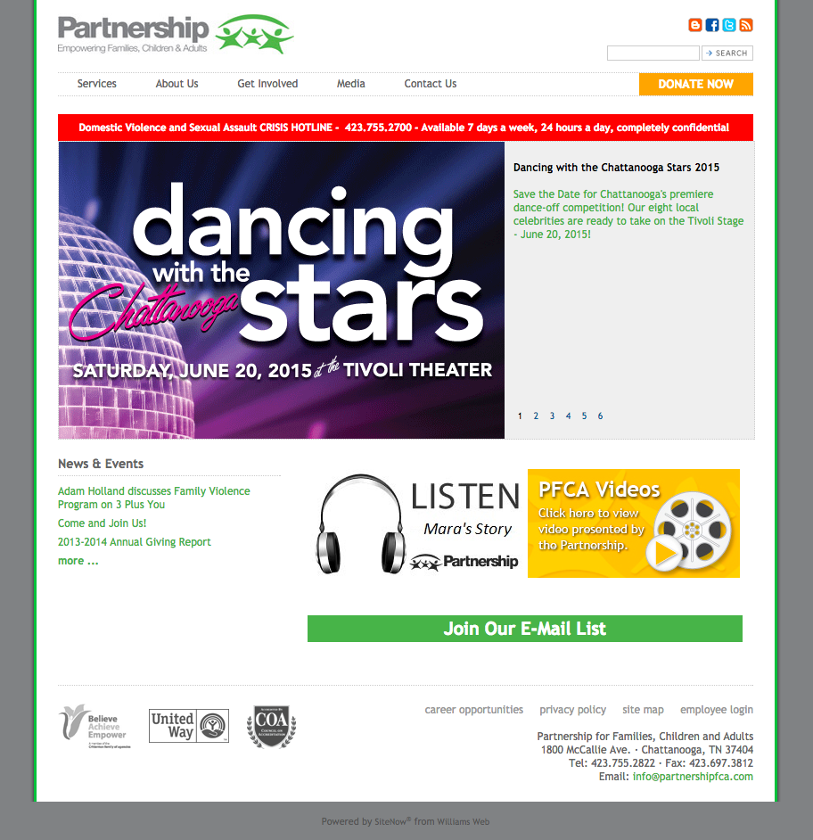
The homepage on the old Partnership site was very clunky and cluttered. There was a lot of information present, but your eyes almost didn’t know where to look because there was so much going on. There were lots of images and links but not a lot of text that informed visitors about what Partnership is or the services it offers.
We wanted the new homepage to be both eye catching and informative, so we combined bright, bold images with text that provides a brief introduction to Partnership and drives visitors to important information throughout the site.
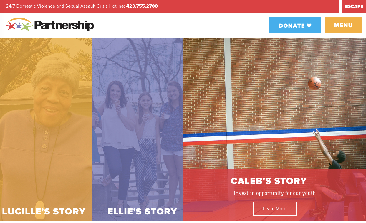
The first thing the visitor sees is a collection of three large images with links to stories about some of the area residents that Partnership has assisted. Next is a brief intro statement about Partnership with a link to its About page, followed by a collage of images representing the organization’s various services and links to their respective pages. Finally, there’s a longer introduction to the organization and a block for upcoming events.
This design immediately clues the visitor in to the parts of the site that Partnership wants them to see and makes that information easily accessible.
The Header
Like any site, the header contains some vitally important elements. Partnership relies on donations, so there’s a prominent donate button in a contrasting shade of blue to draw the visitor’s eye.
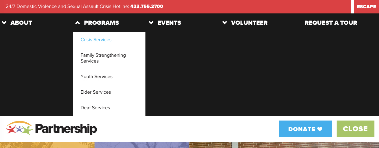
There’s also a small, red escape button in the upper right corner. Because many of the visitors who look at the Partnership site may be in domestic violence situations where their abuser is monitoring their online activity, the organization needed to give them a way to leave the site quickly. This button does just that. One click, and the user navigates to the Google homepage.
These elements appear on every page of the site, so users can see and access them, no matter where they land.
The Donation Experience
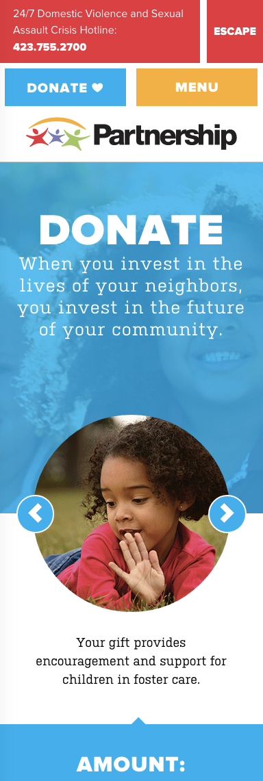
Because donations are so important to Partnership, this section of the site got extra attention. In the old design, users were sent to an external website when they clicked the donate button. We’ve talked in the past about how this can be jarring for the user and can even cause a level of mistrust that might hinder donations. Partnership was smart and asked us to develop a donation experience that would integrate with their new provider, Bloomerang, and keep users on their site.
What we created is a bright, easy-to-use donation page and form that lets users quickly make contributions and educates them about the impact they’re having on others’ lives by doing so. The donate page contains a small slider with images and text that showcases how money is used across Partnership’s different services to make an impact in the Chattanooga area.
Directly below the slider is the donate form. It starts with a simple question: How much would you like to donate? There are pre-selected options, but the user can also enter a custom amount. As they fill in a field, subsequent fields automatically generate to make completing the form easy. Beyond collecting the necessary information, such as donation amount, payment info, and contact information, the form also contains several other important elements:
- An email opt-in box
- A monthly donation option
- A company matching option
- Fund designation
The thank you page also keeps users on the site and lets them know that not only has their donation been received but that it’s also already being used to improve the lives of area residents in need.
The donation experience is so effective that Bloomerang even chose to honor it with a write-up on its blog and a Bloomie, its award for outstanding donor communications in the nonprofit sector.
Photos
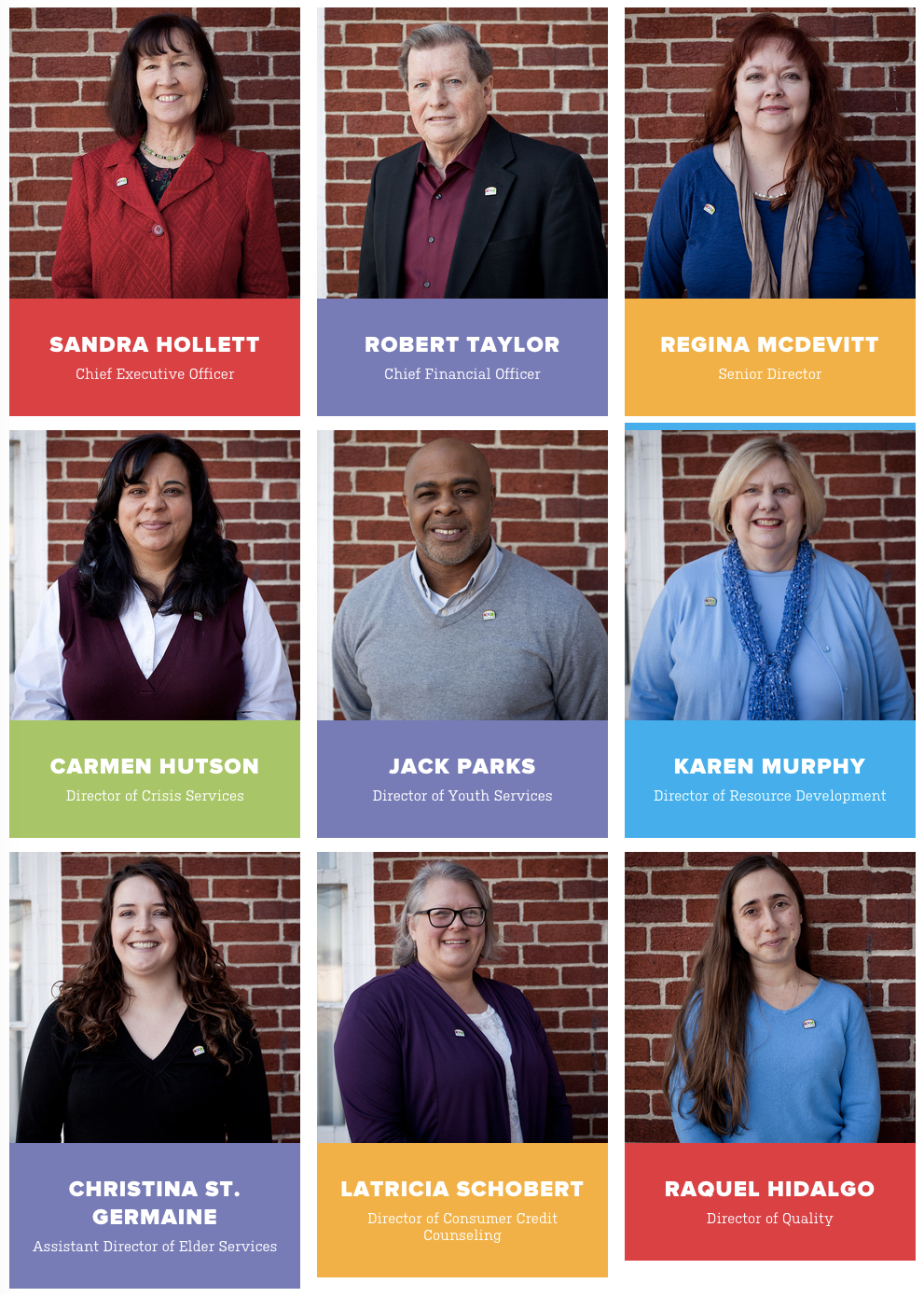
As I’ve already mentioned, photos play a huge role in communicating Partnership’s message. The client understood their importance early on but also knew that getting them would be a challenge, due in large part to the fact that the sensitive nature of many of Partnership’s cases makes it difficult to find willing subjects.
Still, Meagan, our contact, managed to get some professional photos both of the people Partnership has helped and of the organization’s building. For areas of the site where she couldn’t get custom images made, she searched long and hard for stock images that blend in seamlessly with the rest of the photos. We bet you can’t tell which are which.
The images personalize Partnership’s message, putting faces with the vital services it provides and hopefully even increasing the chances that a visitor will make a donation.
Colors
Colors are another huge element in the new Partnership site. The palette is taken directly from their print materials, and we’ve used colors to help draw the visitor’s eye to important content.

One cool feature that we built into the backend of the site is the ability for Partnership to customize these colors across their service area subpages. Each subpage on the site is assigned a color that appears in the large image area at the top of the page. In the backend of the site, they have a drop-down menu that allows them to choose any color from their palette to use in this area. Pretty nifty!
Check Them Out!
If you haven’t heard of Partnership before this post and haven’t seen their new site, please go check it out to learn some more about this wonderful organization. We had a great time working with them, and we’re so happy that we had the chance to help them make a difference in the lives of othe
