Hamburger Icons: The Great Navigation Debate

Navigation is a hot topic in the world of responsive web design. When migrating a fixed-width site to a responsive layout, it’s quite tricky to figure out the best way to make navigation work from a tiny phone screen all the way up to a wide screen layout. There are several ways to organize and display the navigation on a website, but is one way better than another?
The debate on navigation styles has mainly been spurred from this little thing called a hamburger icon.
To Hamburger or Not to Hamburger?
This seemingly harmless, three-lined icon has caused quite a stir in the web community. Some people say it is going to be the downfall of conversions on websites while others think it is an icon or pattern that will be adopted and accepted over time.
I researched this debate quite a bit, trying to comb through all of the opinions, A/B testing, and case studies to find the perfect answer to this burning question. My conclusion is that the perfect answer is very difficult to find, but two articles stood out because they made the most practical sense to me:
The Hamburger Menu-Icon Debate
3 Essential Navigation Trends for 2015
Both of these articles emphasized prioritizing navigation content that you feel is the most important to your users and supplementing that prioritization with the content that surrounds it.
The Facebook Factor
This whole debate frequently centers on Facebook and how they originally came out with the hamburger icon navigation. Here is an image taken from another interesting article on TechCrunch titled Kill the Hamburger Icon:
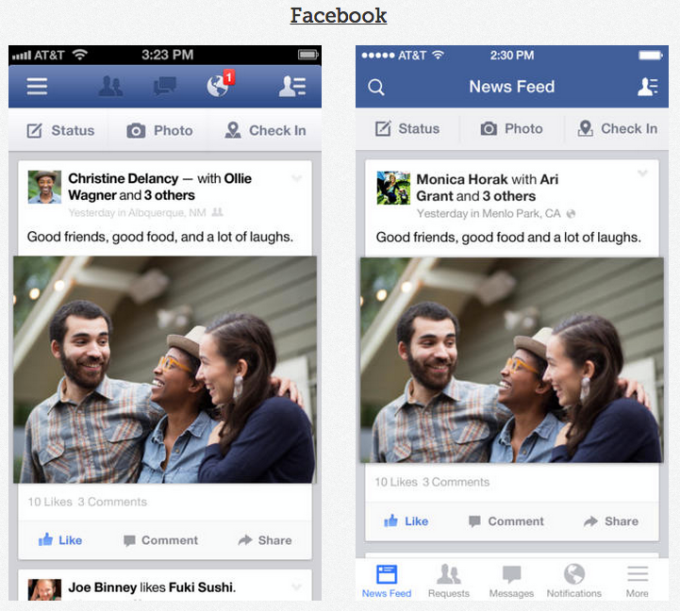
The left side of the image is the old Facebook app interface on your phone. You have the hamburger icon on the top left with some important icons and actions surrounding it. The right side is the updated interface of the app. You will notice a lot of the same icons but some have been moved to the bottom of the screen, and words have been added to the bottom of the icons as well. There is still a hamburger, but it is pushed to the bottom right of the interface. Facebook did quite a bit of research and simply pulled out the more important features of their app to be more accessible and easy to understand. The hamburger is still being used, but it doesn’t hide the important features of the app from users.
When I was investigating this debate, I kept finding that much of the research on the topic is about apps or single-use products. At Papercut, about 99.9% of the work we do is responsive projects that work across platforms and don’t usually focus on one central theme or product. Our projects are usually the representation, or digital brochure, of a business as a whole. A site could highlight products a company sells but also talk about the client, speak to employees of the client, and offer other auxiliary content that is still just as important in the client’s eyes. So, we are trying to get quite a bit of information on a site and have it all work as it moves from a tiny space to a large space.
A Few Real-life, Responsive Examples
Going back to the two articles I found useful, it all comes down to prioritizing that navigational content for your users. I’ll illustrate this point with a couple of examples from past Papercut projects.
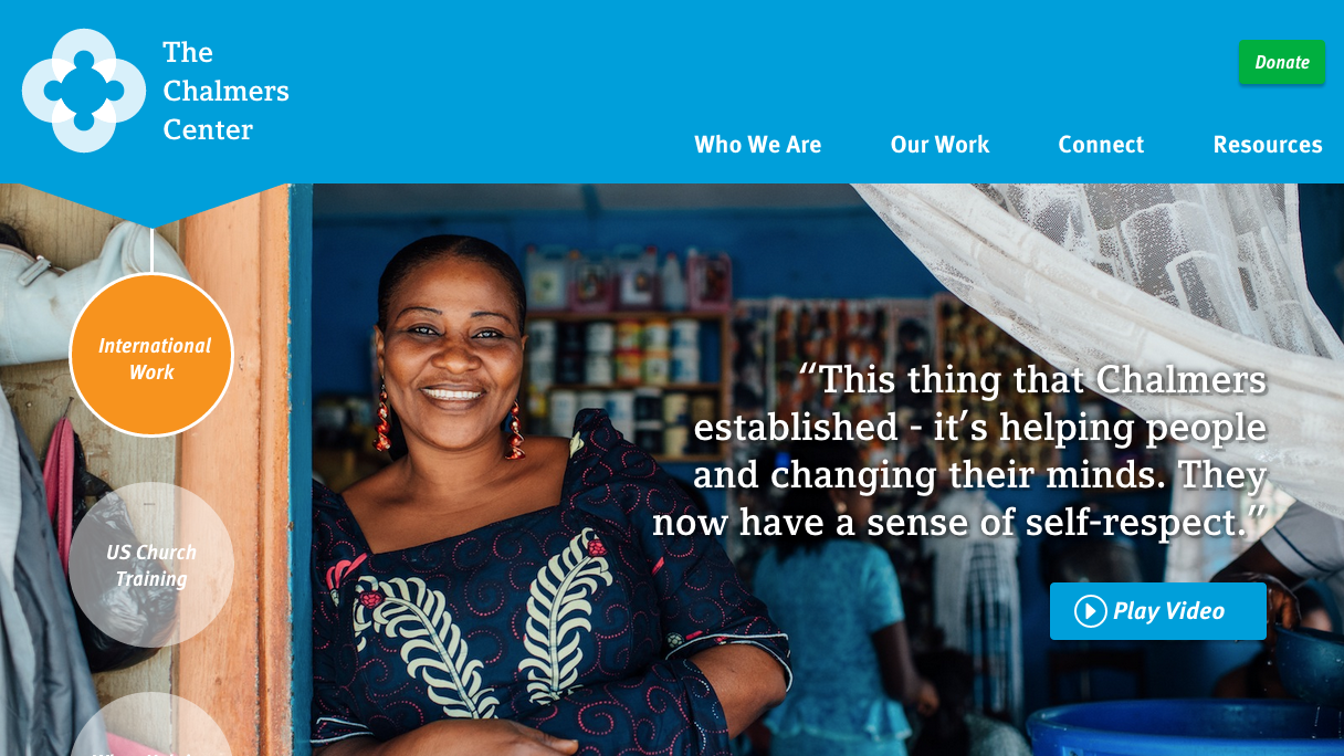
One of our clients, The Chalmers Center, knew that donations were one of the most important features on their site—if they didn’t get donations, they wouldn’t exist. On the small-width devices we made donate a large call to action in the header. The menu is tucked into a simple down arrow but has plenty of room to breathe and sits in the top right so it is easy to access. This is followed by a page full of content and calls to action that lead users to the most important content on the site. The larger view expands the main menu so you can see all the navigation items, and the donate button remains a prominent call out in the header.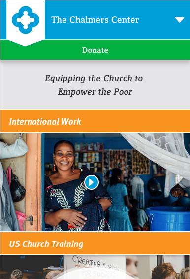
The next client of ours is an e-commerce client, Sophie’s Shoppe. On small-width devices, a user can still access the search, login, and basket easily, and the main navigation is a straightforward word “Shop” accompanied by the hamburger icon. As the site grows in width, the main navigation becomes completely fleshed out for the user to see.


The two above examples are ways we have handled a large amount of content for our clients. I do feel as though developing apps and developing responsive sites will take unique ways of organizing how content is displayed, but it all comes down to the core idea of prioritizing that content. Also remember that when developing responsive sites, it’s important to think long and hard about each page and the content on those pages. For the homepage, take advantage of what you want people to know and push them to the great features of the site there, making the navigation a complement to the content on the page.
The Debate Keeps Going
This navigation debate is going to keep going, guys. Today we may feel one way, but tomorrow we may feel another. I noticed as I was working on this post that opinions on this matter waver from one year ago, but that’s part of the game in the web world—there is never one completely right answer or one completely wrong answer. As long as we take each project individually and dissect the content and goals to make it all easily accessible, we are doing our jobs. What are your thoughts on navigation and responsive sites?