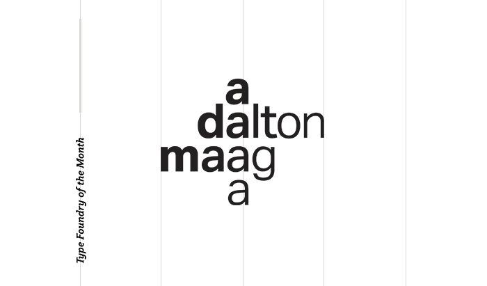
Type Foundry of the Month: Dalton Maag
I thought I would choose a scary topic for October’s Type Foundry of the Month: Someone from Switzerland who doesn’t love Swiss typography?!
Meet Bruno Maag, owner of Dalton Maag. Born and raised in Switzerland, Maag lived most of his adult life in the UK and founded his London-based studio in 1996. Highly awarded, Dalton Maag specializes in typeface design, font engineering and font support services for large corporate clients and branding agencies. Maag’s foundry has worked on high-profile projects with brands such as Amazon, BMW, Toyota, Nokia, and Under Armour.
The type designer’s main Swiss beef is with a font he compares to “vanilla ice cream.” It’s maybe one of THE most recognizable fonts of today – Helvetica. Dun dun dunnn!!!
Maag regards the use of Helvetica as a designer’s “lazy choice.” While you’re ensured to have a clean look, Bruno feels that the font is so chronically overused that you are also ensured to have a bland and uninteresting design.
Not only does Maag dislike the font because of its overuse but also its structural issues that stem from the font’s origin. Helvetica was originally a hot metal typeface and was translated digitally with that process’ same kerning issues.
Aktiv Grotesk
These qualms led to him to design his version of Helvetica’s original inspiration, Akzidenz-Grotesk, a font released in 1896. The result was Aktiv Grotesk, which has turned out to be extremely successful. The full suite is now used by Under Armour and the airline Cathay Pacific. Designed for digital use, Aktiv solves the fussy kerning issues of Helvetica, surpassing its concept of architectural perfection.


Rio 2016
Dalton Maag also designed Rio’s Olympic game font. Based off the 2016 logo created by Brazilian design agency, Tátil, the script font expresses the soul of the city beautifully. The fluid strokes are inspired by the city’s landmarks. The typeface took eight months to create and consists of 54,448 characters. An interesting note is that the kerning is purposefully tight. It’s intended to save paper, due to Maag’s concern with sustainability.


(Thanks to Fast Company’s Co.Design for these images!)
Author’s Pick: Plume
I’m a huge fan of any san serif with some flair. Perhaps best used as a display font, Plume gives off a funky vibe while also sporting some stunning ligatures.

What I enjoy about Dalton Maag’s typefaces is the coexistence of structural rigidity (harkening back to the founder’s Swiss roots – grids grids grids!) along with playfulness and uniqueness in each font.
Dubbed the “angry man of type,” Bruno Maag is an opinionated and outspoken individual, yet his charm and humor keep him well-liked in the design community. I think you can see that personality in his typefaces.
Choose your favorite of his typefaces on the Dalton Maag foundry site or read more about him in this AIGA Eye on Design article.