Type Foundry of the Month: Emigre
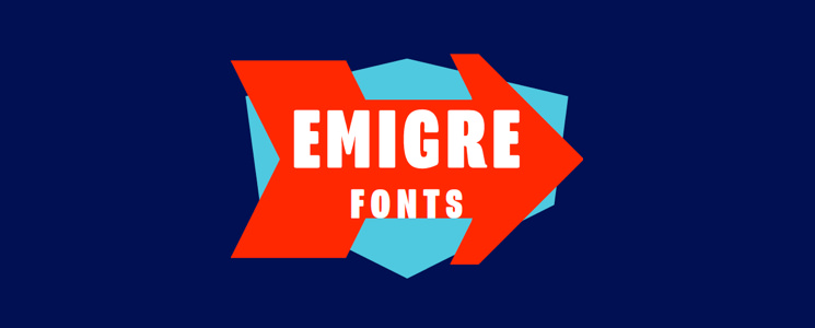
Emigre Fonts is a classic, an “OG” you could say. They speak, you listen. They say, you do. This foundry was established in 1984 and was one of the first independent type foundries to focus solely on computer technology to create its fonts. Not only is this foundry known for its distinct typefaces, but it’s also recognized for publishing an acclaimed design journal as well. Here at Papercut, we have used several of this foundry’s fonts in our projects. They are fun, well thought out and unique typefaces that definitely set a brand apart.
Thanks to Emigre for all of they great images found in this article. Venture over to their website and you can see all of their great work.
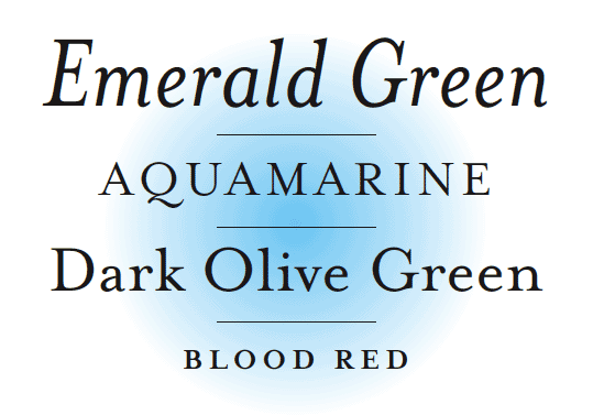
Mrs. Eaves
The first typeface to talk about is probably the most popular Emigre typeface, Mrs. Eaves. This font is a classic serif option, but the things that set it apart are the beautiful organic details on the letters and the wonderful glyphs it comes with. Mrs. Eaves is no joking matter and should be used to convey a trustworthy, classic appeal.
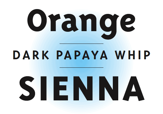
Triplex
The next typeface is Triplex. This one is quite different from Mrs. Eaves; it’s much more bold and geometric. Triplex is best used in places of titles and importance—let those strong, vibrant characters shine. This typeface comes in a variety of both sans-serif and slab options, as well as tall to wider varieties.
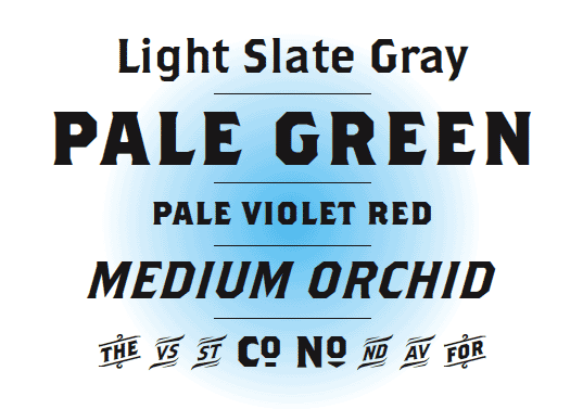
Brothers
Brothers is a font that’s ideal for decorative purposes and bold statements. This is an interesting font that blends serif and sans-serif attributes. It’s a blocky and distinct font that will leave your viewers remembering its character. Brothers comes in a nice variety of weights and styles but it also has a great set of glyphs to play around with that will complement any design you have.
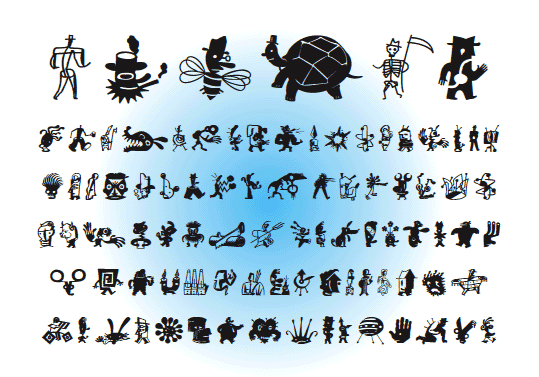
ZeitGuys
Finally, for just a little bit of cray-cray, there’s ZeitGuys. This is not so much a typeface as it is a set of interesting illustrated characters. It has a style all its own—kind of reminds me of a Matisse/Tim Burton-inspired set of characters. They’re fun to look at, but I’m not sure when I would ever use them.
Check Them Out!
Emigre Fonts is a foundry that knows what it is doing. From bringing together a wonderful circle of type designers to publishing an acclaimed design journal, Emigre loves what it does and it shines. Look through their site, and you can learn about the library of the fonts they offer, as well as their publications, books, essays, news articles, and other interesting design “things” that will be a feast for your eyes.