Type Foundry of the Month: Emily Lime
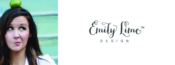
August’s Type Foundry of the month is Emily Lime, a fairly new, one-woman type foundry started by Emily Conners and based in Greenville, SC. Emily is a self-taught type designer who primarily creates script-y fonts due to her passion and enjoyment of calligraphy.
Emily worked in technology for many years, putting in 70+ hours a week which led her to do some soul searching and find a career she was really passionate about. While working in technology sales, she was able to pick up a few graphic design skills and found herself building on those skills, falling in love with typography and learning as much as she could in her free time. As her love for design and type flourished, she decided to create and release some fonts, and she soon became a best seller on several font vendor sites.
My Picks from Emily Lime
All images below are courtesy of MyFonts.com. Thanks for sharing!
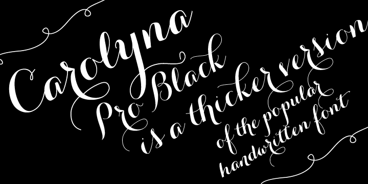
I first encountered Carolyna Pro Black when I worked as an intern at a stationery design company in Knoxville, TN. Here at Papercut, we have a project in the works utilizing Carolyna Pro Black. This whimsical and informal font is versatile in that it works on the web, can be used for logos and is also popular on printed items such as stationery. It stands well on its own and also pairs nicely with more rigid, serif fonts.
I enjoy the carefree and spontaneous strokes that make it friendly and inviting. It reminds me of receiving a decorative hand-written note from a friend, and it gives designs a nice personal feel. Carolyna, its sister font, is a similar option in a lighter weight. Both come with a high number of glyph and swash options, so you can really have fun with the details of how the letterforms fit together.
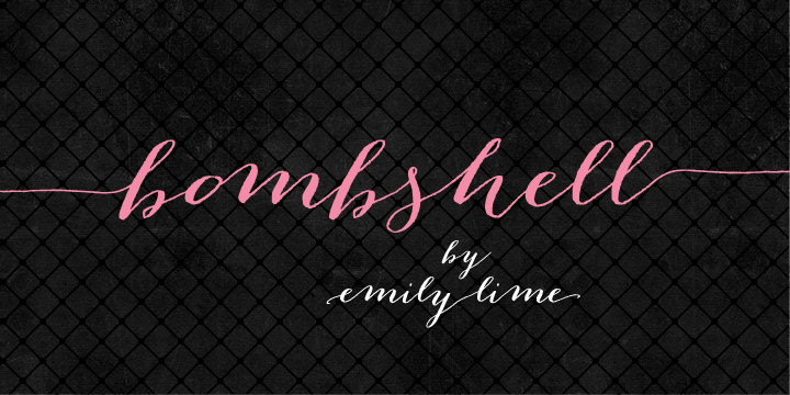
Bombshell Pro is another script font from Emily Lime that has become very popular. Like Carolyna, it also resembles realistic, informal calligraphy. It’s great for headings because of its “run-on” letter connections. It also comes with roman numerals.

Bergamot is an interesting contrast to the calligraphy-inspired fonts. It still has a casual and informal hand-written quality, but it’s actually inspired by more formal serif and headliner fonts. It has a playful twist that I could see pairing nicely with some fun illustrations or being used to create a more relaxed feel.

Larou is quirky, curly, and fun. It is less elegant than Carolyna, and because the letters are not uniformly sized, it is unexpected and can lend a fun energy to layouts.
Benefitting the Design World
I think Emily Lime is interesting because it is yet another example of how the Internet is changing the way we design and find fonts. People of diverse backgrounds have the ability to educate themselves on design and independently develop their passion. This can only benefit the professional world of design because it is like adding more spices to our spice rack!