Type Foundry of the Month: Fenotype
This month’s foundry is Fenotype. This foundry stood out to me because of the backstory of the founder, Emil Bertell. Emil released his first typefaces in 2002 when he was only in high school. He had an interest in design, a computer, and the Internet. Soon, he found himself releasing his own typefaces, which were eventually downloaded and used by others around the world. Emil’s first typefaces were definitely the experiments of a curious young mind, but that interest stayed with him and he is now a reputable type designer selling beautiful typefaces that are used and displayed by top brands.
I look at Fenotype, and I just get straight up excited. The fonts are beautifully constructed with elegant curves mixed with thick and fat lines, but none are too feminine or too masculine. The fonts can be used to represent a wide range of topics and can be complemented by any sturdy, legible typeface. I sure am a sucker for these kinds of typefaces, though. I love seeing perfectly constructed Bézier curves—the way to this designer’s heart. Below are just a few of Fenotype’s typefaces that I love to see and love to use whenever possible.
Special thanks to Myfonts.com for the awesome images!
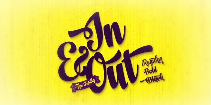
Ok, I have something to admit. I was pretty obsessed with this typeface when it was first released. Ugh, I could not get over the dang glyphs. So many great options to play around with and it is just so good to look at. For a few months I really had to tell myself to walk away—I felt like everything I was designing needed this typeface somewhere. I am ok now, I have learned to keep this one for special occasions.
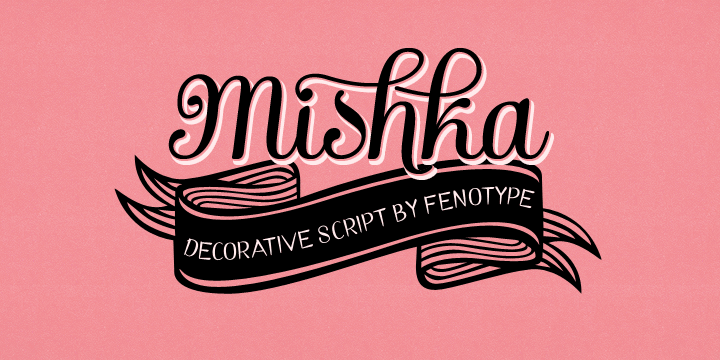
This is probably Fenotype’s most reputable font. It is also a really beautiful option for headings or ornate layouts. It comes with a beautiful set of ornaments to play around with that will make any designer happy.
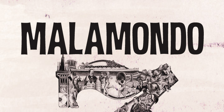
This typeface is a nice alternative to the majority of curvy, more organic options from Fenotype. It’s still a bit organic in that it has curves and bends, but it is more masculine as it’s an all caps display font and comes with a very interesting and versatile set of ligatures that interlock.
These are only a few of the fonts available from Fenotype. I highly recommend checking out all of the options and sprinkling some into your next project!