Type Foundry of the Month: Fontfabric
This month, we are taking a little trip to Bulgaria! Well, not really… Fontfabric is a type foundry made up of four designers: Svet Simov, Radomir Tinkov, Ani Petrova and Vasil Stanev. The founder of Fontfabric, Simov, said that he is drawn to typefaces with strong geometry. When looking at their, work you can see many references to great Humanist types like DIN, Futura and Avant Garde. Still, their love for well-worn geometry doesn’t keep them from having fun.
Here are just a few of my favorite typefaces from this foundry.
Special thanks to Myfonts.com for the images!
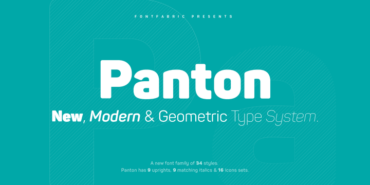
Panton Black
Panton Black was the first Fontfabric font that jumped out at me. This font has a rounded, friendly feel that makes it perfect for displays and maybe even as a logo type. If Panton Black isn’t your thing, don’t worry. The font comes in a whopping 34 weights!
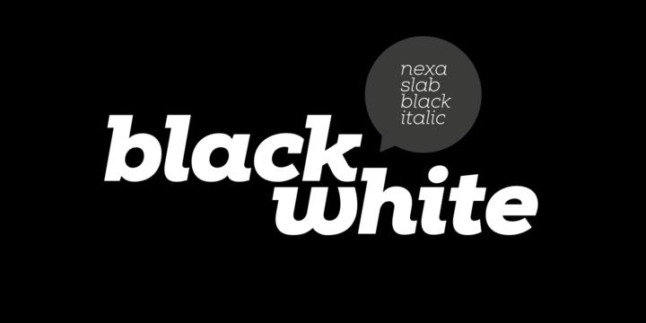
Nexa Slab
I’ve always been a sucker for a good slab serif typeface. Fontfabric has made a pretty sturdy one in Nexa Slab. This font is available in many weights, but I think it really comes into its own as Nexa Slab Black Italic. This weight has a strong visual rhythm.
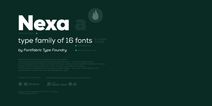
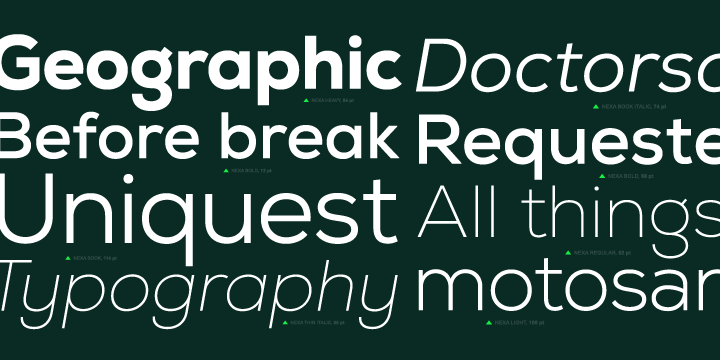
Nexa
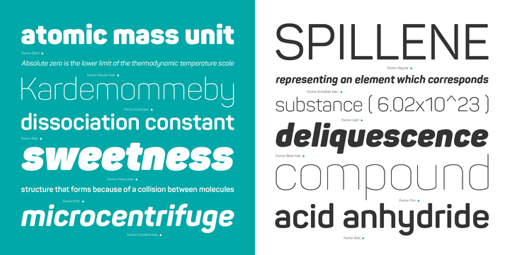
Everything I’ve pointed out so far has been a big, flashy display font. What about a great body copy font? You need legibility in a variety of font sizes, and you need plenty of font weights to choose from. Fontfabric has created a pretty nice font in Nexa, which has the makings of a work horse.
There you have it! Some of my top picks from Fontfabric. Check out their site and share your favorite font in the comments!