Type Foundry of the Month: Fort Foundry
This month’s type foundry is Fort Foundry. This foundry is great example of what creative curiosity and a passion for type can create. Fort was born from the mind of Mattox Shuler and is a product of a fun side-project exploring type creation. In 2013, Fort released its first professional typeface.
Much to Shuler’s surprise, the foundry took off. After just a few releases, the foundry was showing up on a “Hot New Fonts” list.
It’s easy to see something classic and timeless about Fort’s fonts. Here are just a few of my favorites:
Special thanks to Myfonts.com for the awesome images!
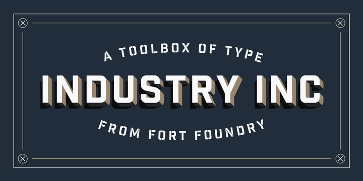
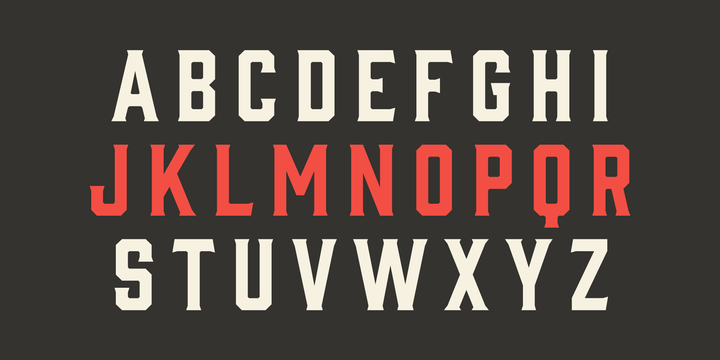
This monospaced, all caps font has the makings of a real workhorse. It has a multitude of weights and styles that can work in almost any display setting. If you need a great text font, check out its little brother, Industry. It has many of the same traits as Industry Inc but gives you the choice of lower-case characters.
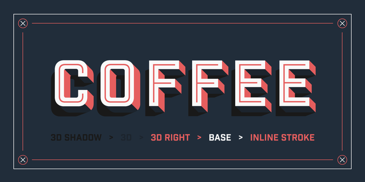
This is another great font. Prohibition really harkens back to the era for which it’s named. It’s a great example of Fort’s inventiveness with its type treatments. Just check out Prohibition Rough Oblique. It would look perfect burnt onto a wooden box full of illegal gin.
Speaking of gin… This font is the serif-ed answer to Prohibition. I love the little ticks for serifs. This font screams to be used as signage.
I’m sure we haven’t seen the best from Fort Foundry, and I can’t wait to see what they will do next.