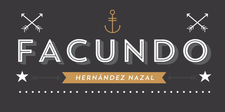
Type Foundry of the Month: Latinotype
Organic, playful, sophisticated, sassy, sturdy, elegant, structured—this is just the beginning of a long list of words to describe the type offerings that come out of Latinotype. Latinotype is a foundry established in Santiago, Chile by Miguel Hernandez, Luciano Vergara, and Daniel Hernandez. They describe their foundry as follows:
Latinotype is a new digital type foundry established in the year 2007 in the city of Concepción, Chile. Our goal is to design new typefaces remixing diverse influences related to our South American identity (most often known as “Latino”) with high quality products for the contemporary design industry.
Why Latinotype?
I particularly wanted to discuss this foundry because, these days, I am coming across more and more client projects that are using fonts from Latinotype. This might seem trivial, but when you look at the world of type, there are literally hundreds of thousands of fonts to choose from that come from hundreds of different foundries. Seeing a certain foundry popping up so frequently is definitely a sign that we should get to know them a little better.
Prior to writing this post, I did not know much about the people behind Latinotype, and I will tell you it has been hard finding information. MyFonts.com does a great monthly e-newsletter in which they showcase up and coming fonts and interview type designers. In January, they happened to interview Latinotype—it’s a very in-depth read, but it’s really worth it.
To summarize it briefly, these guys seem like some really cool and talented dudes on a mission to bring the world very well-thought-out fonts that represent the Latino culture and the world beyond. They enjoy working with other designers for inspiration and are always looking to share and evolve their knowledge and passion for type.
The Fonts
And now the fun part. Here are just a handful of Latinotype fonts that I really like. This only scratches the surface, so please check out their website to see their full offering—it is well worth it!
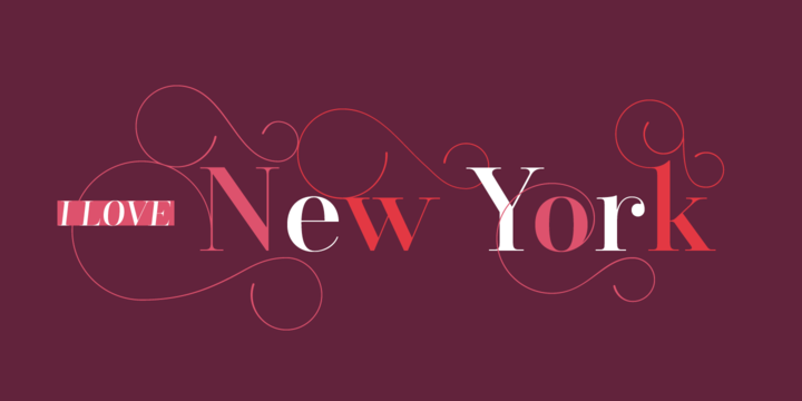
One very important note here—throughout this post, you are going to see really beautiful images, and that is all thanks to Latinotype and MyFonts.com. They do a great job of creating visuals to show you how the fonts can work in real design (Here is a link: http://www.myfonts.com/foundry/Latinotype/).
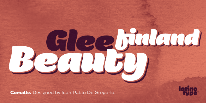
Comalle
Lady crush time. OMG. This font just hits you in the face with organic, curvy, beautiful confidence. If you are looking for a font to grab attention and have some fun with, this is a great option. This font is big and strong but can be complemented very well by a simple, geometric sans serif.
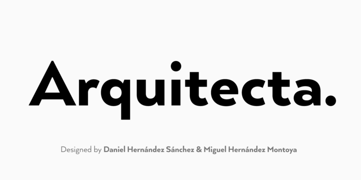
Arquitecta
One of the most basic and fundamental fonts for any designer is a humanist typeface, and Arquitecta is Latinotype’s humanist offering for designers. This font is highly influenced by the very popular Futura and Avant Garde, but again, like all of Latinotype’s fonts, it has its own very subtle flavor and unique shape.
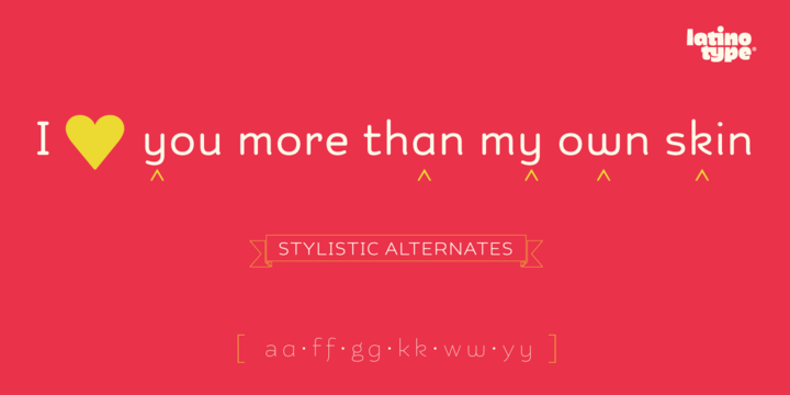
Kahlo and Kahlo Rounded
Slender, elegant and fun. Kahlo is another typeface that comes with the basic structures and influences of a timeless font but also has hints of flair with its swash versions of each character and decorative elements. I just love the simplicity and open feel of this font, but what really sells me on it is this unique little twang and curve on certain characters that distinguish them from their counterparts.
Trend
One of the important points the Latinotype founders discussed in their interview is being able to please young designers and creative directors by producing fonts that stay on trend with what is going on globally. Design has DEFINITELY been influenced by slab fonts—the hipster scene has had an unquestionable influence on the growing popularity of this style. Trend is a layered sans and slab font that comes in a variety of styles, weights and decorations. This is the kind of font that any designer should have in their tool box.
Santis
This is an example of a classic Bourgeoisie, high fashion, editorial-influenced typeface. The basic structure is from Didot, which alludes to its sophisticated purpose, and Latinotype has accompanied it with a nice selection of decorative accents to creatively use in typographic layouts. If you want something to come off as sophisticated and fancy, pull this font out and go to town.
Don’t Take My Word for It
These are just a few of the fonts that Latinotype offers, and as you can see, they all meet fundamental typographic needs but manage to showcase the foundry’s unique style and mission. I really love how Latinotype can simultaneously be very serious and have quite a bit of fun with their fonts.
Again, explore their full selection; they truly have a font for every occasion. And if you do take the time to look around their site, let me know what your favorite is in the comments!