Type Foundry of the Month: Lineto
Wow, April seems to have flown by, and it’s time to talk about type again! So, let’s “spring” right into things. This month’s featured foundry is Lineto.
Lineto is a digital font foundry founded in 1993 by Cornel Windlin and Stephan Muller. This Switzerland-based organization collaborates with many typographers, artists, and graphic designers from around the world to create beautiful digital fonts.
About the Foundry
Lineto is influenced by International Typographic Style, also known as Swiss Style. This movement rejected design’s former “beauty for the sake of beauty” notion and viewed design from a “form follows function” mindset instead.
Swiss-inspired fonts, like those produced by Lineto, are known for their cleanliness and readability. They usually follow a grid-based format that focuses on precise letter formation. You can see a model of Lineto’s lettering structure below. Although carefully constructed, its innovative application and asymmetrical layout really set the foundry apart.
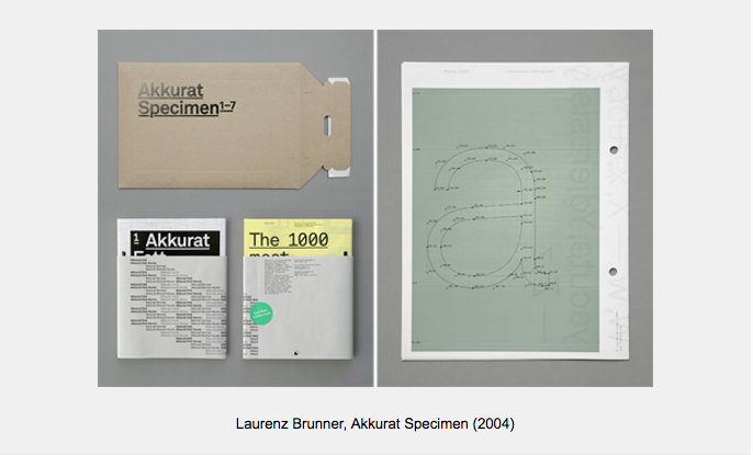
Image source: phaidon.com
My Picks from Lineto
Now that you have a little background on Lineto, let’s review some of my favorite fonts. Here are a few of my picks, which also happen to be some of the foundry’s most popular.
Akkurat
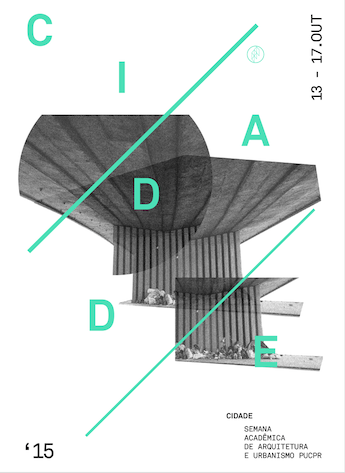
Image source: fontsinuse.com
Created in 2004, Akkurat was designed by Laurenz Brunner. It’s a refreshing take on the font Helvetica and classic Swiss style. Its x-height is tall, compared to similar typefaces, while still keeping a degree of roundness and readability. This makes Akkurat a great option for body copy. It may lose its personality as a headline font. If used as a large header, I’d give it plenty of space and a minimal layout. This will allow viewers to really admire its nuances.
Unica77
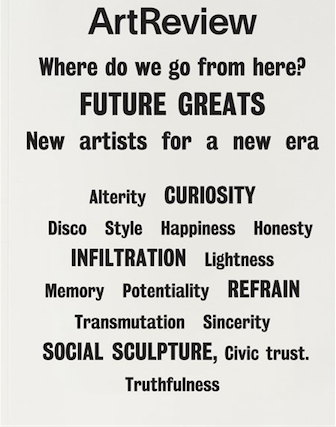 Thanks again to fontsinuse.com for this image
Unica77 is a re-issue of Haas Unica, and another font influenced by Helvetica. Haas Unica has an interesting history – it’s kind of a typography cult classic. It slipped into oblivion for 30 years when its original foundry, Haas, went under. Ownership of the typeface grew murky as the company switched hands, and a competing foundry also claimed it as their own.
For years, it was used on the blackmarket by designers. It wasn’t until 2014 that Unica77 became the only authorized version of Haas Unica. It is known for its sleek functionality, but it also has humanity in its uneven line strokes.
LL Brown
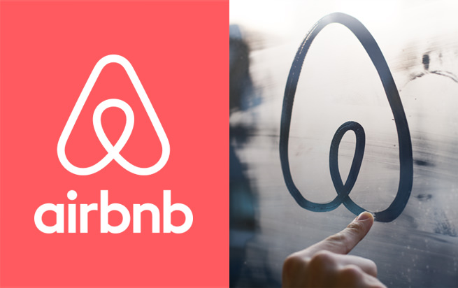
Thanks to blog.airbnb.com for this image.
You’ve may have seen LL Brown the last time you booked a vacation. Designed by Aurèle Sack in 2007, it’s the font used in Airbnb’s logo. The round lettering and the brand’s looping road graphic speak to Airbnb’s “belonging in a global community” message. The font’s simple, techy appearance emphasizes the idea of travel at your fingertips.
Forward-thinking Fonts
In my opinion, Lineto is Swiss form and function reimagined. I’m excited to see how these versatile designs grow and continue to be used by new brands.
What’s your favorite Lineto font? Let us know in the comments.
