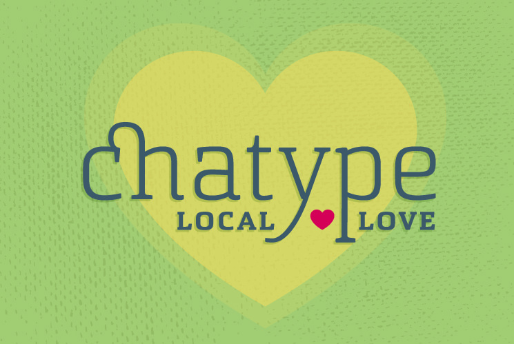
Type Foundry of the Month: Local Love – Chatype
For May’s Type Foundry of the Month, I wanted to do a little piece on local typography and focus on one specific typeface. Papercut Interactive is based in Chattanooga, TN. A not-too-small but not-too-big city nestled in the rolling hills of the Appalachian Mountains alongside a winding river. If you are an outdoor enthusiast who likes to have the perks of city life near you, Chattanooga is a pretty awesome place to be. What many people who aren’t from Chattanooga don’t know is that this city has a very strong and growing design and technology community. We have written past articles about the unique offerings at the local library and the design talks and conferences that are held around town. Another really cool thing that has happened in Chattanooga is the development of a custom typeface for the city called Chatype.
How it Came to Be
Chatype was an idea brought to fruition by typeface designers Jeremy Dooley and Robbie de Villiers, creative director DJ Trischler, and Jonathan Mansfield. So, Chattanooga has this other great event every quarter called 48hr Launch. It is one weekend where people can pitch ideas and there are developers, designers, photographers, and other professionals there to volunteer and help get those ideas started in 48 hours. Chatype brought their idea to the November 2011 48hr Launch and got their idea off the ground with a video, website, and branding. Soon after that success, they launched a Kickstarter campaign that was fully funded by February 2012, and the typeface was released to the public in August of 2012.
Chattanooga received quite a but of recognition for creating its own custom typeface. The story has been featured in national publications such as Fast Company, The Atlantic, and Good, just to name a few.
Where to Find It
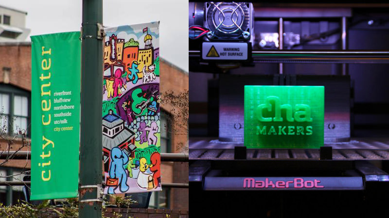
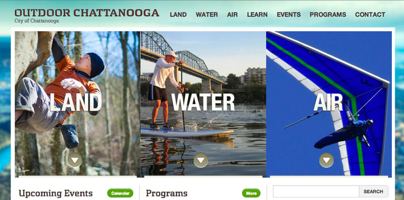
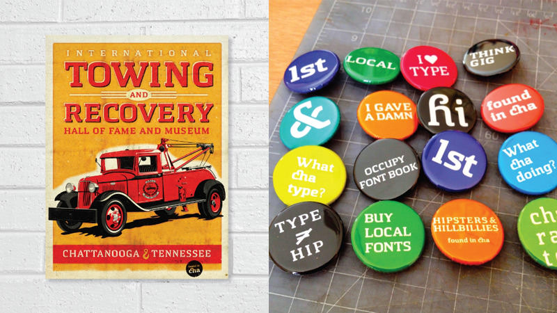
Since its release, Chatype has been used all over the city. From street signs to city signs to city websites, it’s almost everywhere. The font is free and open source, but the creators ask that it only be used on projects pertaining to the city of Chattanooga. So, don’t go using this typeface in your logo project for an Idaho potato farm!
Chatype is described as a futuristic slab serif font that pays homage to Chattanooga’s industrial past but also embraces Chattanooga’s growing technology community. Not only does it embody all of the above characteristics, but it also integrates a little bit of Cherokee influences to represent the history of the Tennessee Valley.
Below are some images of Chatype around Chattanooga. It is pretty neat to see it being used in so many different ways throughout the community, from fancy city signs to people simply expressing their love for this neat, little/big city.