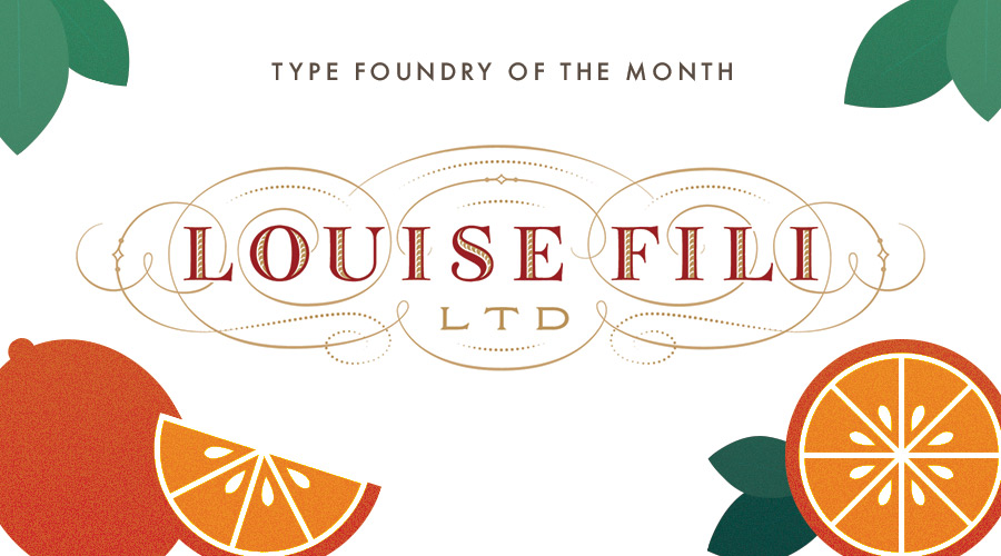
Type Foundry of the Month: Louise Fili LTD
Since the weather is starting to get warmer here in Chattanooga, I’m focusing this month’s type foundry on a designer whose work makes me feel like I’m at an Italian café
Born in 1951 of Italian-immigrant schoolteachers, Louise Fili began practicing typography at age 16. She bought an Osmiroid pen out of the back of a catalog, taught herself calligraphy, and started selling illuminated manuscripts of Bob Dylan lyrics to her classmates. She attended Skidmore College, later interning at the Museum of Modern Art in New York City. At age 25, she was hired as a senior designer under Herb Lubalin (basically the king of American graphic design). After, she worked as an art director at Pantheon Books, where she designed over 2,000 book covers.
Fili’s obsession with Italian design in particular also began at age 16, on her first trip to Italy with her family. As they were leaving the Milan Airport, she noticed a billboard for Baci Perugina chocolate which featured an “art nouveau rendering of a couple in a passionate embrace against an inky night sky, with just the words Baci and Perugina.” This is something the designer has stated she never forgot – a memory that has fueled a fruitful career of modernist design. Since that initial trip, Fili has gone back to the country a countless number of times for more inspiration.
In 1989, the designer decided to leave Pantheon and set up her own studio, Louis Fili LTD. At a time when there were few female-owned businesses, Fili was wary of self-naming the studio: “I realized that it would be a liability to name the studio after myself, but I wanted to send a clear message: If you have a problem with my being female, then I have a problem with you as a client.”
This turned out not cause too much of a hindrance for the designer. On her first day of opening her studio, she was called by Disney to design a logo for their publishing branch, Hyperion – a project that she completed in one week. Since then, Fili has worked for a number of high-profile clients, including Tiffany & Co, Good Housekeeping, Paperless Post, and many more. She has received Gold and Silver Medals from the Society of Illustrators and the New York Art Director’s Club, the Premio Grafico from the Bologna Book Fair, and three James Beard award nominations.
Today, Louis Fili LTD focuses on food packaging and branding for restaurants and remains a small-sized studio based in New York City.
Thanks to louisefili.com for the imagery!
Along with countless logos, book covers, and other design work, the studio has released several typefaces to the public that have just as much attention to detail.
Montecatini
Inspired by early 1900’s Italian travel posters, this typeface is the epitome of Art Nouveau. The stacking ligatures and curved legs give the font a flair that can make any design chic.
Mardell
This Italian Futurist typeface was designed for the Hamilton Wood Type Museum, and is named after Hamilton retiree and veteran woodcutter Mardell Doubeck. It was originally created as wooden blocks to make prints and can be purchased in that fashion, as well as in digital format.
Marseille
This typeface is based off of one of Fili’s most iconic designs: the cover for the Marguerite Duras novel, The Lover. With a large range of 6 weights, tall x-height, and narrow width, this font gives off a delicate yet poignant look.
Having become a staple of New York City signage, Louise Fili LTD’s design is easily recognizable with its hand drawn elegance and Art Deco style. It gives you a sense of timelessness, subtle lavishness, and rich cultural background.
In a time where logos are trending towards becoming more simplified and streamlined marks, Fili’s baroque flourishes are a breath of fresh Italian air.
See more of Louise Fili LTD’s work.