Type Foundry of the Month: Mark Simonson Studio
This month’s type foundry post focuses on the work of Mark Simonson Studio. Simonson’s career as a graphic designer and art director began in 1976. In the early days, he discovered a passion for type design, and he began selling his fonts online in the early 2000s. Since then, he has working solely as an independent type designer.
Here are some of my top picks from his collection of fonts.
All images courtesy of Mark Simonson Studio.
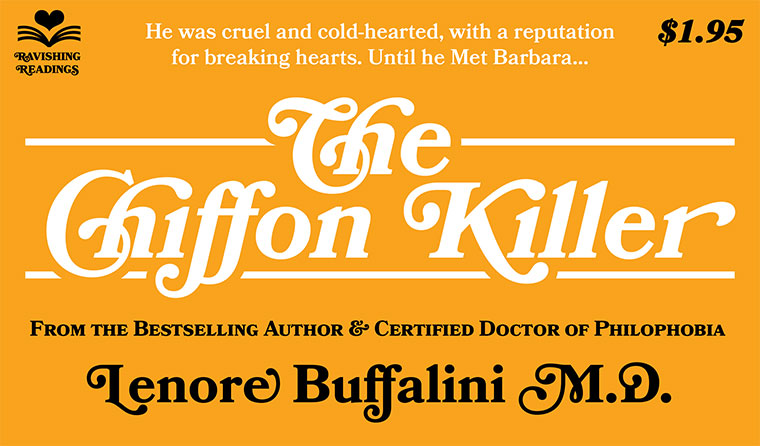
Proxima Nova
Currently, Simonson has around 122 fonts on the market. One we at Papercut find super useful and fun is the Proxima Nova family.
Proxima Nova is a full-featured and versatile family of 48 fonts (eight weights in three widths with italics). It is a great combination of modern proportions with a geometric appearance. Let’s face it, if this font can “bridge the gap between Futura and Adzidenz Grotesk,” you need it in your toolbox.
Kinescope
Up next is Kinescope.
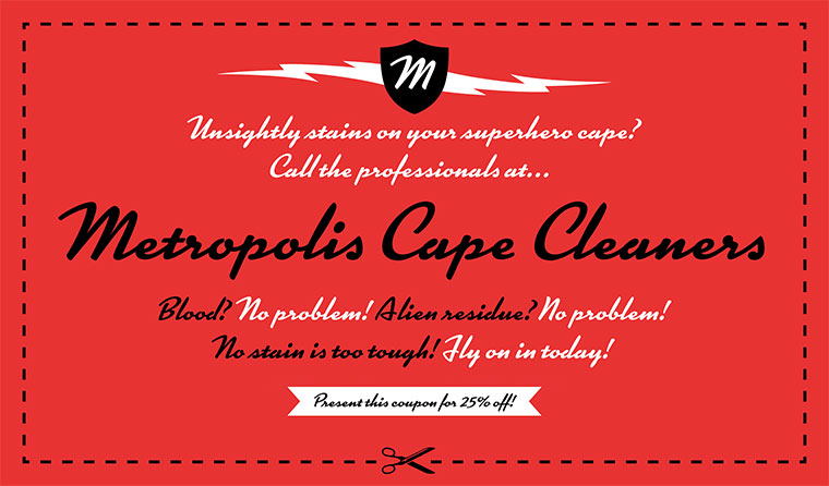
Kinescope is simply beautiful. This 1940s-style brush script is inspired by hand-lettered titles in the Fleischer Brothers’ Superman cartoon series. I can see this font working well in headlines on the web. With its lines and weighting, Kinescope is a perfect display font.
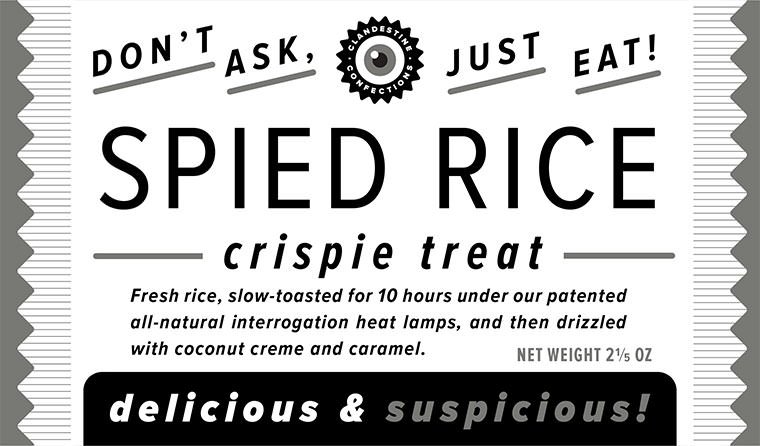
Bookmania
Lastly, my favorite, Bookmania!
Bookmania takes is sturdy design from the original Bookman Oldstyle (1901). This font includes fun swash curls and ligatures and a broad range of weights, meaning it works great for display use, but it also works well for text. I really can’t wait to use this font in a project.
Those are my top picks. Checkout the Mark Simonson site for yourself and share your favorites in the comments!