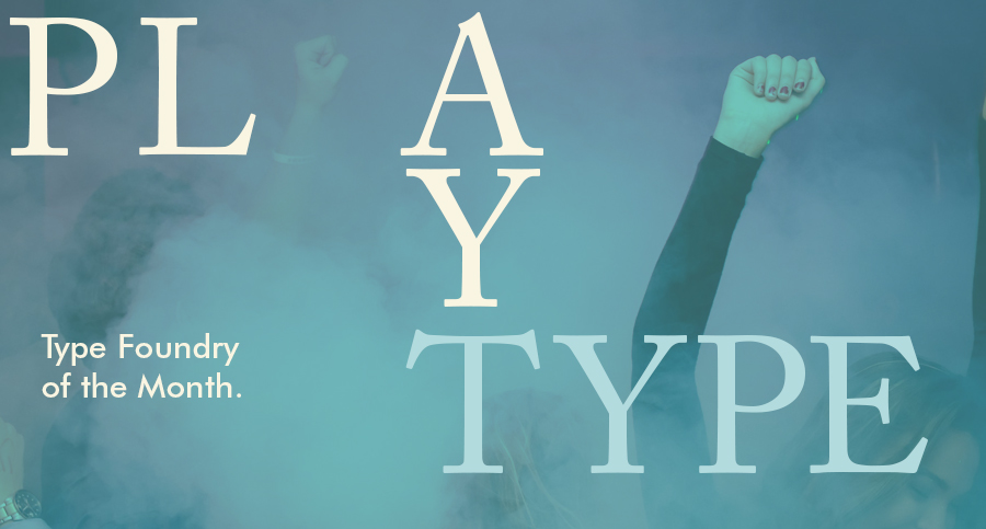
Type Foundry of the Month: Playtype
Playtype is a foundry located in Copenhagen, Denmark started in 2010 as an experiment of the design agency e-Types. e-Types is a well known Danish design firm that has produced work for products and brands that have deep roots in their country’s culture. This includes the Prime Minister’s Office, The National Museum of Denmark, and the Lego Group.
Playtype now has more than a hundred fonts and nearly 500 font weights. They have also set up an online marketplace and an actual storefront in Copenhagen to express their love for iconic typography and well-designed artifacts.
Most of Playtype’s work oozes the Danish style of type and design. Clean, well structured lines with deliberate strokes compliment the hard angles in most of their typefaces.
When researching Danish style type, I usually look for these forms:
- A flat apex of the A
- The widening of diagonal terminals
- A double-storey g with its loop terminating before it forms the bottom most stroke (Erik Spiekermann coined this a Danish g)
- A single-story g with a stumpy tail
- A K with an almost laterally moved crotch, connected to the stem by an extra horizontal stroke
- Widened diagonal connecting strokes forming flat apex or baseline strokes.
- Bulging cross strokes
- Tapered terminals on cross strokes
If you don’t know what some of those terms mean, there’s an excellent typographer’s glossary on Playtype’s site!
I had to be very selective with fonts that I wanted to share. Playtype really knows what they’re doing, and they cover so many styles in their work. With more than a hundred families to choose from, it was difficult to select just a couple. I was originally hunting through the core of their work trying to find something truly Danish. Then, I found their commision work, which hits the mark.
Skagen
This typeface was originally created as a bespoke typeface for the Skagen watch brand to celebrate the Danish design style. Skagen, a coastal town in Denmark, is the original inspiration of the company’s brand and where it borrowed its name. The town of Skagen is known to carry a simplicity through design and the typeface here shares that mentality.

This is wonderfully Scandinavian. Recently, Skagen (the company, not the town) has reserved the use of this typeface to all-caps. But the image above shows the Danish G as well as some other Danish characteristics.
DKT
Incepted by e-Types partner and creative director, Jonas Hecksher, DKT was created for the Royal Danish Theater. DKT brings a flexibility to the Theater’s brand. The font can easily be manipulated from a serious, professional title to a playful and whimsical humor. Hecksher notes that this is what the theater needs to reflect its broad range of shows and audiences.

Berlingske
This typeface is one of the largest families Playtype has created. Berlingske supports both western and eastern character sets, plus Cyrillic, Greek, Latin, Baltic, and Vietnamese. In fact, Berlingske is available in 170 languages!

Berlingske was originally created for Denmark’s oldest newspaper, Berlingske. Now, after several years of further development, Berlingske has more than 229 weights and almost half a million glyphs! It’s safe to say that this specimen takes a while to get through.
I find the serif family to be the most interesting. There’s nice little quirks about it. I love the simplicity of erasing the top stroke of the lowercase R and just leaving the ball terminal in its place.

It solves some kerning issues when sitting next to a character with a counter, such as an A or O. The ball terminals are consistently used in other characters, but not in such a unique way as the R.