Type Foundry of the Month: Positype
Positype: A positively decadent foundry for the holiday season
I figured it would be fitting for this month’s type installment to focus on an indulgent foundry.
Positype has been offering flavors ranging from retail typefaces, to custom fonts, to hand lettering since 2000. Marshmallows, shortbread, thin mints, oh my! These typefaces are pure decadence.
Based out of Georgia, Positype isn’t just fluff. It’s founder, Neil Summerour, won the Type Directors Club Certificate of Typographic Excellence 6 times. He was also a 2012 recipient of the People’s Choice Award in the Morisawa Type Design competition for his Japanese typeface, Tegaki. And he currently serves as Chair for the Society of Typographic Aficionados.
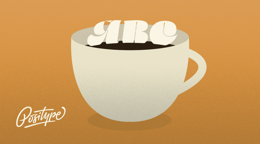
Summerour and team have worked with brands such as Oculus, Facebook, Victoria’s Secret, Revlon, PINK, Good Housekeeping, David Bowie, BBC, L’Oreal, Panera, Audible, Coors, ABC, and many more.
Marshmallow Script & Fluff
Summerour describes Positype’s latest release as having “[an] almost painful amount of contrast.” Marshmallow first started with his disappointment with the Lust Hedonist family he designed in 2014. Even with its success, he was unsatisfied that the flared ends of the script were not connected. This meant it wasn’t a true script font.
After some more experimenting with Lust, Marshmallow was formed in 2016. Though it was originally intended to belong in the family, he saw it had too much personality and deserved its own moniker. The type designer states he “laughed out loud” when he landed on Marshmallow as the name, inspiring him to go back and add even more details and additional characters. The result was a mouthwateringly contrasted and excessive typeface. The font also comes in a separated version, Fluff, if a more uncomplicated structure is needed.


Girl Scouts Custom Typefaces
The Girl Scouts of America came to Positype looking for more type prevalence in their communications, and also more age-flexibility. One monkey wrench was that they needed not one, but a whole suite of typefaces for their many divisions and uses. Summerour took this challenge in stride and designed Trefoil Slab and Trefoil Sans (the brand’s main font), as well as Shortbread Script, Trefoil DIY (a more decorative font), and Thin Mint Script. I believe he was very successful in creating a diverse array that somehow stays harmonious to each other.
And that’s the way the Girl Scout cookie crumbles.


Author’s Pick: Magneta
Forcing myself to choose outside of the Lust/Marshmallow family, I’d have to say Magneta is my next favorite. Being a quieter typeface of Positype, at first glance this may seem like any other serif. But, there is real beauty in the subtle details. The diamond tittle (dot over the ‘i’), many ligatures, and unexpected swashes make this an attractive and versatile font, whether it’s used as display or body text.


A self-proclaimed “fanboy of type,” Neil Summerour has a sit-back-and-let-the-work-speak-for-itself style. Not a fan of being up front and center, his passion is for the craft of typography. I think this leads to work that is humble yet stunning – the icing on the cake of any design.
Fun fact: Summerour designed the typeface used on Café Du Monde’s beignet mix packaging. Yum.
(Thanks for the photos, Positype!)