Type Foundry of the Month: Sawdust
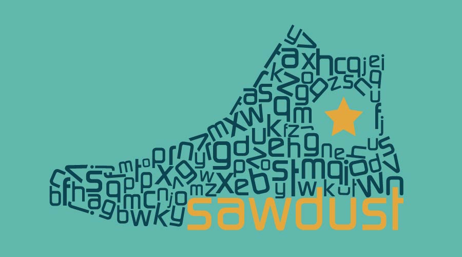
Two men in London, Jonathan Quainton and Rob Gonzalez, came together to create the wonder that is Sawdust. They specialize in several things: bespoke and innovative typography, brand display typefaces, and visual identities and image.
Sawdust’s work is displayed all over the U.K., U.S., and Norway. They have worked with everyone — from Audi to Nike to National Geographic. And they’ve been nominated for a myriad of awards, including the German Design award, and received 7th Place of UK Studio Ratings in 2015.
 Converse
When Nike decided Converse needed an updated logo (Nike owns Converse… who knew!), they went straight to Sawdust. Before Converse was a shoe company, it was a rubber company. But in 1923, Chuck Taylor made the first pair of high tops. Because they are so old, you can imagine the amount of designs they have gone through to represent them. Here are a few, just for reference.
 Thanks to The Drum magazine for these Converse images!
In more recent events, however, Converse’s logo has switched from a curvy-robotic look to a more humanist one:


Just in case you don’t know what “humanist” means in this case, it’s okay — neither did I before doing a little research. In essence, way way back in the renaissance when black lettering was the key player in design, people started shifting towards a more reader-friendly typeface. Humanist fonts are fonts that look more handwritten. They’re easier to read, and overall just simpler.
To demonstrate, I made this illustration of the two different S’s from the converse logo.

The red S is from the original font. Notice the harsh 90 degree angles on the inside of it’s curves, along with the general shape of a square. Now, if you take a look at the grey S, it’s quite a bit more circular in nature. With the exception of the ends of the letter, there really aren’t any angles on it.
The grey S is much more humanist. Think of it this way: Which version of this letter are you more inclined to handwrite? The grey one, right?
Wired UK
In my opinion, this is one of Sawdust’s best creations. There are two versions of the font. One appears flat, while the other looks three-dimensional.

 Thanks to It’s Nice That for these images!
In an interview with publisher It’s Nice That, the Sawdust team explained how and why they created the two versions: “We needed a typeface that would work in black and white both flat and three-dimensional. For the flat version, it goes without saying that the colour could be adjusted easily (it didn’t need to be set in just black or white) but changing the colour for the 3D version, logistically become exponentially more complex and so we agreed a black and a white version was best. Therefore when working in 3D it became important to keep tonal variants of white and black to facilitate its use across photography.”
Final Thoughts
So that’s that. Wired UK really grabbed my attention simply because it doesn’t look like any other font I’ve seen before. And, if I’m honest, the converse brand got me simply because I wear converse more than any other brand. I hope you enjoyed reading this as much as I did researching Sawdust!
About the Author: Gussie Gaston is a senior at Chattanooga School for the Arts and Sciences. She’s interning at Papercut to learn about graphic design as part of her senior project on the psychology behind fonts and colors and how designers use them to their advantage.