Type Foundry of the Month: Suitcase Type

In the spirit of summer travel, let’s “carry on” our series with Suitcase Type Foundry. (We love a good pun at Papercut!)
This independent type foundry was founded by Tomáš Brousil in 2003 as a place to store his creative endeavours. Located in the Czech Republic, Suitcase specializes in retail types for professional and corporate use. Inspired by 1950s and 60s typography, Brousil’s designs are reminiscent of those decades’ innovative simplicity.
Now that we have a little context on the foundry, let’s take a look at a few of my favorite picks from Suitcase.
Monopol
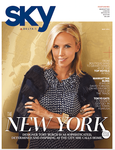
There’s no more fitting place for a Suitcase font than stowed on a plane. Reach in your front seat pocket on a Delta flight, and you’ll see Monopol on the cover of Sky Magazine.

Since the 19th century, condensed san-serifs, like Monopol, have been at the forefront of advertising design. So, it’s no surprise that Tomáš Brousil included this family in his line of work.
Monopol extracts the spirit of Univers and its formal, Swiss principles. The tall, slender letter forms retain readability while appearing almost stretched. The type family’s thin weight offers thread-like elegance, while the bolder weights really showcase the geometric angles that bring Monopol to life.
Altament
Altament was first thought-up and designed as the brand font for Suitcase. Brousil drew his typographic inspiration from the cover of Devētsil, a Revoluční slovník almanac. It’s interesting to see how Altament’s bolder families, that read masculine and strong, are contrasted with softer edges.
Altament in italics and all-caps is great for headlines, posters, and magazine covers. Its narrow proportions speak loudly without overwhelming a confined space. The typeface’s rounded strokes and shifts in line weight give it a friendly appeal. No wonder it’s the chosen type for not only Popular Mechanics, but also Vanity Fair and Creative Mornings.
RePublic
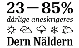
RePublic was the product of a printing competition held by the Czech State Department in 1955. At the time, the printing press had few quality fonts and no resources to purchase an out-of-state font. Stanislav Maršo’s typeface Public won, and in 2003, Suitcase digitized the font and recast it as RePublic.
The original drawings were adjusted to give a more modern feel. The text form, however, remained structurally appropriate for newsprint, which uses cheaper ink and paper. Today, RePublic can be seen in L’Opinion, a France based daily newspaper.

Front Cover Fonts
Suitcase Type Foundry’s contemporary design makes it perfectly suited for advertising and display. Each glyph is so clean and well thought out that it’s easy to appreciate its form as it pops from the page. If you want a memorable typeface that captures readers on-the-move, turn to Suitcase.
Thanks to Suitcase Type Foundry for the imagery in this post!
