Type Foundry of the Month: TypeTogether
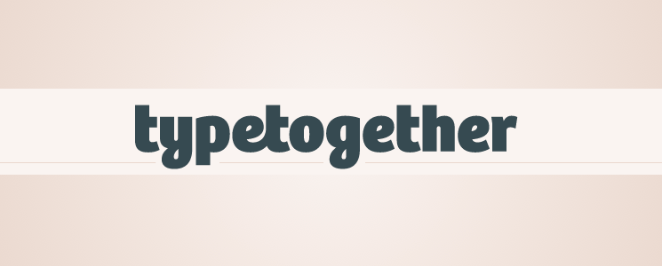
For this month’s type foundry feature, we’re taking a look at TypeTogether. I really wanted to discuss TypeTogether because I initially noticed them a year or two back when webfonts first became a realistic option for the web. I would spend time searching through Font Squirrel or Google Webfonts looking for free options for projects that just didn’t have the budget for paid webfonts. As I searched, a few fonts kept popping up that looked particularly professional and too good to be free. Those were Bree Serif, Abril and Crete Round. Side note: Finding TypeTogether started a personal and pretty intense love affair with another gorgeous font called Adelle, which we will get into later…
Finding these beautiful free fonts spurred my curiosity. I thought it was very smart of TypeTogether to offer a few free versions of its fonts, maybe a little too smart, in fact. You could only have one weight and style of your chosen font, and of course, it made you want a few more options to use on a project—the perfect bait for any type nerd.
After seeing these fonts, I did some research and looked a little further into TypeTogether, which opened a whole new window of beautiful type. TypeTogether was created by Veronika Burian and Jose Scaglione in 2006. It doesn’t call a single location home. Instead, their designers work long distance with each other, as well as other designers. They describe their fonts as:
“Innovative and stylish solutions to old problems for the professional market of text type faces, with a focus on editorial use. This is where the greatest challenges are faced: creating typefaces that perform well in continuous reading, that also have a high degree of personality.”
TypeTogether has given each of its fonts quite a bit of personality. They offer classic, reliable fonts, but they modernize them with a unique flair and twist. Take a little bit of time to study their fonts as a whole, and you will begin to recognize the definitive characteristics that lend each typeface the TypeTogether stamp.
Below are just a few of my favorite TypeTogether fonts. Again, the images used throughout this post come from TypeTogether’s site. They have beautiful banner images to show off their fonts, so we thought we would use them here as well!
Abril
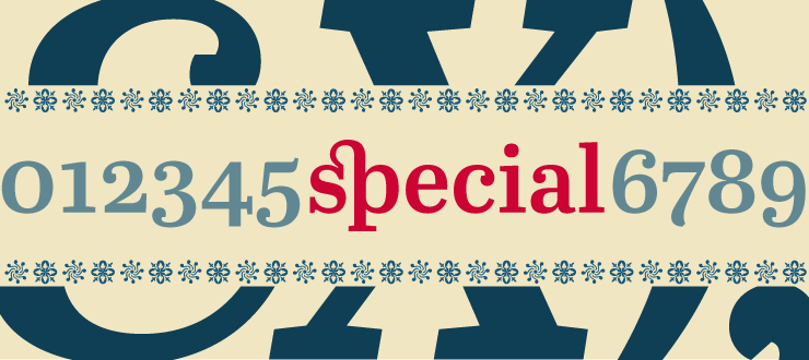
Abril, oh Abril. This font family is a Pandora’s box of beauty. The font was specifically developed for editorial use, and it’s definitely one you would use to catch someone’s attention. It is full of surprises too… just check out their glyphs. Swoon.
Adelle
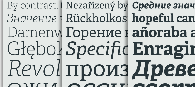
Is it a coincidence that this font shares its name with a Grammy Award-winning, powerhouse songstress? I think not. As I mentioned earlier, I do have a weird obsession with Adelle. This font comes in a wide range of weights and styles. The thin version is clean, simple and very legible, and it contrasts very well with its heavier versions. Looking at the typeface in foreign languages makes me kind of jealous that English doesn’t have more glyphs—it just looks so dang good.
Crete
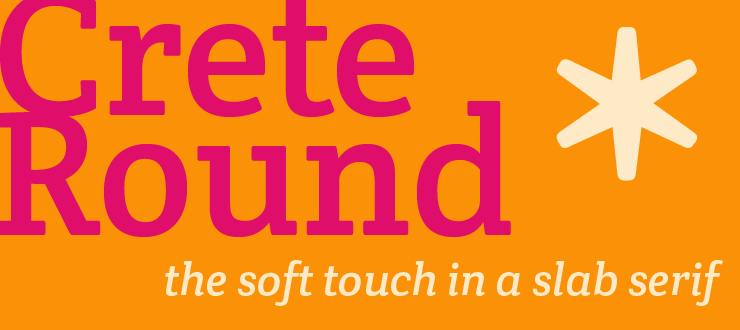
Crete is a great font to use as display text. It is designed to be feminine, graceful, and soft but also comes in varieties that give it a thicker, stronger feel. I love that it offers a rounded option to the traditional slab serif. That little touch of the rounded edges gives it a soft, alternative appeal.
See Them for Yourself!
These are just a few of my top TypeTogether picks, but they have a lot more to offer. Head on over to their site to see their full list of offerings and check out all of their great resources. I hope you enjoy TypeTogether and get a feel for their distinctive style.
Until next month, type friends!