Updating the Homepage for Sophie’s Shoppe

Homepages are designed to catch a user’s interest and encourage them to dig deeper through a website. Some homepages lead straight to calls to action, while others lead the user to explore additional content on the site.
Sophie’s Shoppe, a Chattanooga boutique and a Papercut client, recently decided that they are going to ramp up their e-commerce functionality, and they came to our design team to discuss some ideas.
We helped Sophie’s achieve their goals in three ways:
1: Creating callouts on the homepage
We checked the analytics on the Sophie’s homepage, and it really didn’t seem to be driving consumers deeper into the site. Many of the products being purchased were isolated to a certain area on the homepage. On some sites, selling on the first page a user hits is the goal. However, because Sophie’s has so many products in all shapes, colors, and sizes, they wanted people to dig through the entirety of the site. We tackled this goal by adding a variety of categories to the homepage with photo callouts. So, instead of having one large photo driving traffic, we have four different ones directing visitors to different areas. This is a nice contrast that doesn’t overload the page with products or visual information.
2: Improving brand identity using new typefaces and colors
Notice I didn’t say that we changed the brand identity. Since Sophie’s entire brand (and business) is driven through the products they sell and their design, their brand has to be versatile. Most of the colors are relatively neutral and the typefaces don’t have any overbearing qualities. For the update, we changed the accent colors of the site to accompany the season. The current color, peach, gives a nice tone to the site. The colors will probably rotate throughout the year as products change (we wanted Sophie’s to have a real feng shui). We also updated the accent font to something more modern. The bouncy feel of the typeface brings some youth and fun to the letters.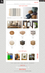
3: Creating a slight UX buff through subtle animations
The homepage also received some updates to the way a user interacts with content. Images and buttons now animate slightly so a user can really get a sense of the action they are about to take. These types of effects aren’t totally necessary, but they add familiarity for a user, make the page feel more interactive, and expand the brand. For Sophie’s, we kept the animations neutral so they complement the brand, not exaggerate it.
Keep Engagement High
Sophie’s understands one of the most important aspects of web design and development—getting visitors to engage with your site. Throughout the update process, we also added additional categories allowing for even more products to be added to the site when the client is ready. We’re hopeful that, with these homepage adjustments in place, more of the users landing on the site will view additional content (and that Sophie’s will sell more merchandise).