Why Type Matters
As you read the headline and copy in this post, you might not realize that we chose to use these fonts for specific reasons. The headline font is Futura, a popular font that is formed by simple, clean shapes. The font we use for the larger areas of copy on our website is Chapparal. This font is a nice contrast to Futura, as it contains more complex shapes, including distinct angles and organic curves. We chose these fonts because we knew they complemented one another and would be easy for you, our readers, to read.
Who knew that so much thought goes into the way words appear on a webpage? The fact is, type is extremely important. It can affect how your brand is perceived and how you convey your message. With each project we get at Papercut, we take the time to research fonts and make sure we choose the right type for the client. When choosing a font, it’s important to consider a few things:
Emotion
You might not realize it, but type does make you FEEL a certain way. Typography is all about emotion. Take a look at the diagram below and notice how these different typefaces evoke different emotions.
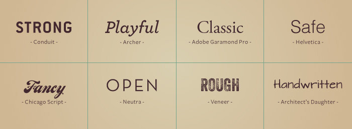
It is really important to consider emotion when choosing a font to ensure that the words on the page line up with the client’s target audience and business. You don’t want to send mixed messages on your site by using a font that is out of character for your brand. For example, if a site is targeted at an audience of men in the industrial industry, we might choose a sturdy font, like Conduit. In contrast, if the project is pointed toward youth at an attraction, we may opt for a playful, yet legible font, like Archer. If we used a sturdy font on an attraction site, the final project might have a disjointed, confusing feel. The next time you visit a site, take a look at the type and think about how it makes you feel. Does it match your expectations?
Consistency
For a long time in the web world, we were only able to use a few fonts that would actually render in a browser, but over the last couple of years, more and more fonts have become available to use on the web. Let me tell you, life online has gotten a heck of a lot prettier. With the ability to choose from thousands of fonts, we are now able to guarantee consistency in projects, meaning that how a brand looks in print matches how it looks online, and vice versa. Little things like this provide for a smooth customer experience with your brand, no matter where consumers encounter it.
Legibility
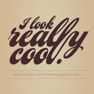
This is probably the most important factor in choosing type. With so many fonts being used online now, you need to keep in mind that type is how people read content. Flashy, fancy display fonts can be used, but they should only be used when appropriate and should never be used as the main font for a project. Using type correctly will make people stay on your site longer and want to keep reading what you have to say. Rely on your type choices to make your content accessible and legible—there is no reason why it shouldn’t be.
Take Time to Notice
The next time you visit a website or read a magazine, take some time to notice the type that is being used. It can be pretty interesting, and you will be surprised at just how much you start to like or dislike some type choices.
Do you have a favorite example of type on the web or a favorite font? Let me know in the comments!